UI / UX Design
Gamifying Literacy: Fixing the "Empty Reward" Loop in EdTech
Eurl Kitabquiz had a brilliant concept: kids take quizzes on books to earn points for real-world gifts chosen by their parents. But the product was bleeding users. I led the UX/UI redesign to bridge the gap between a parent’s busy schedule and a kid’s need for instant motivation.
Industry :
EdTech / Mobile
Client :
Eurl Kitabquiz
Project Duration :
8 weeks
Year :
2017
TLDR
The app suffered massive drop-offs because parents were skipping the "gift selection" during onboarding, leaving kids with zero motivation to read. I redesigned the dual-app experience, restructuring the parent onboarding to guarantee gift creation, while injecting vibrant, playful UI into the kids' interface. The result: parents successfully added an average of 3 gifts on day one, fixing the core retention loop.
The Challenge: The Buyer vs. The User
EdTech products face a unique friction: the person buying the product isn't the one using it. Here, we had two distinct audiences with conflicting needs:
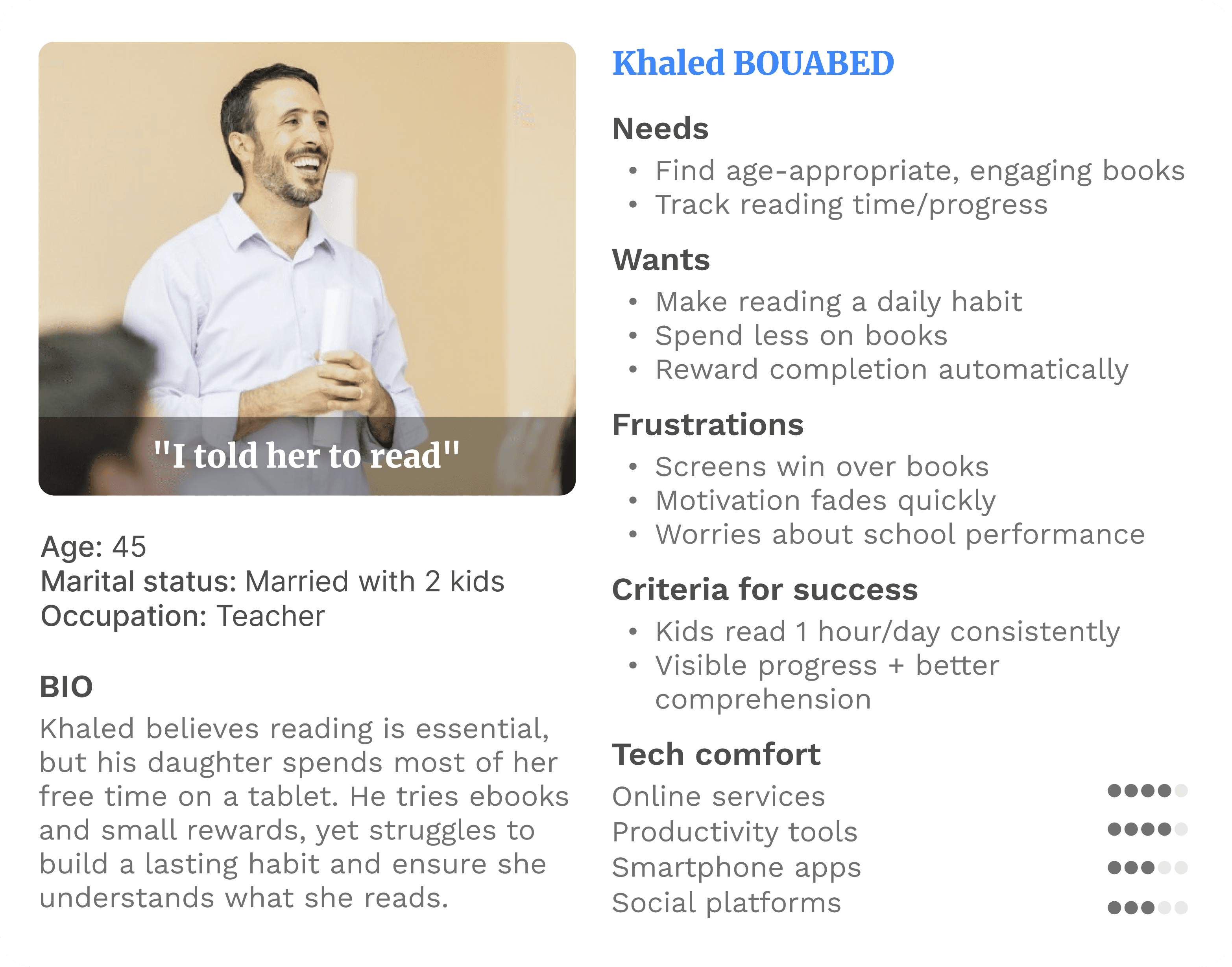
The Parent (The Buyer): They know reading is important, but they are time-poor. They need utility, speed, and automated tracking.
The Kid (The User): They aren't motivated to read by default. They need fun, engagement, and clear rewards (gifts).
The existing product used a generic, "one-size-fits-all" UI library that satisfied neither. It was too clunky for parents and too boring for kids.
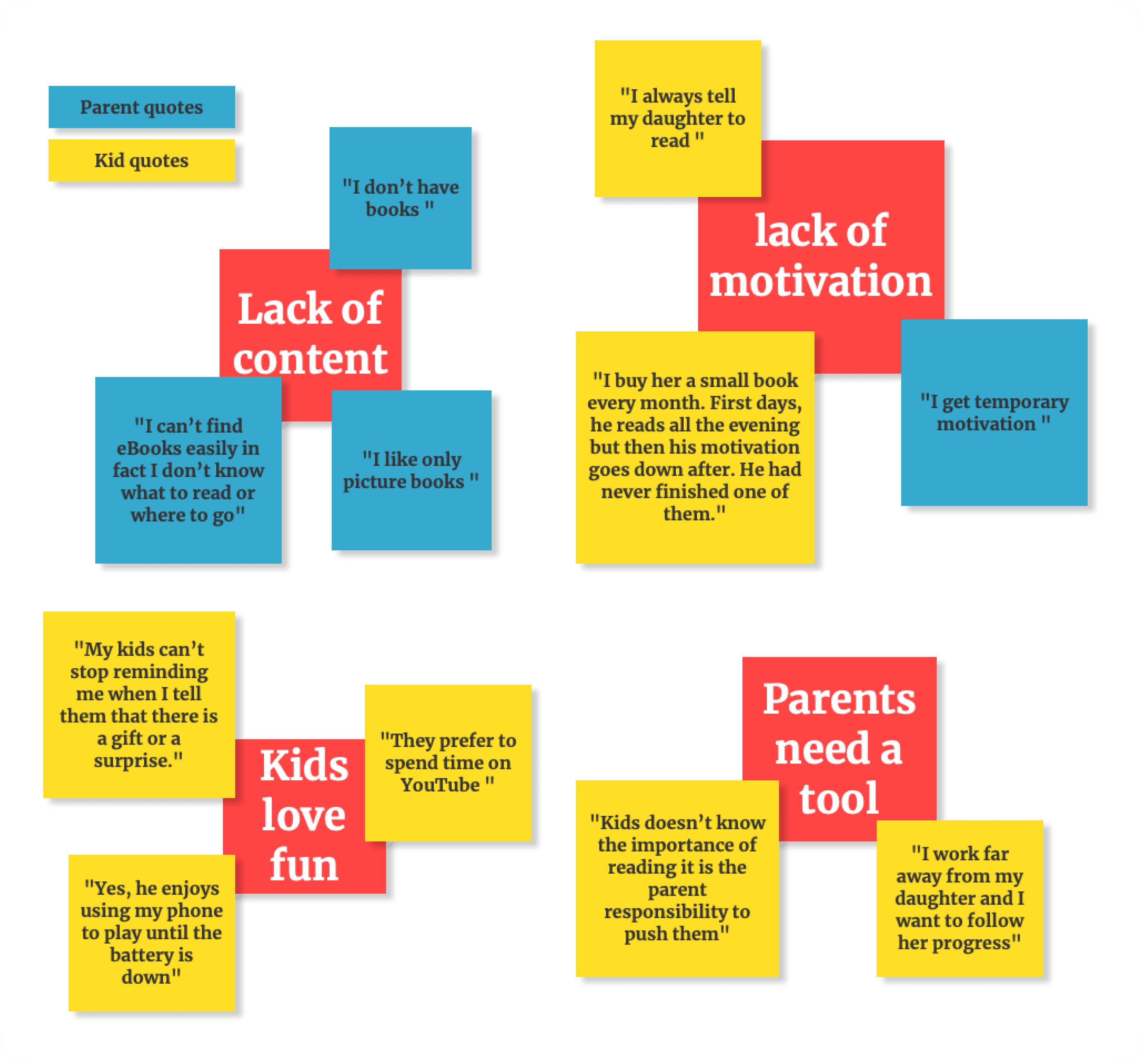
The Audit: Finding the "Zero Gift" Churn
Before sketching a single screen, I sat down with the CTO to look at the data and answer one critical question: Where exactly are users dropping off?
The data pointed to a fatal flaw in the Parent Onboarding.
The Friction: The original flow asked parents to add their child's profile, but made adding a gift a secondary, hidden action.
The Impact: Parents were setting up profiles but leaving the "Gift Vault" empty. When the kid logged in, there was no reward to work toward. No reward meant no quizzes. No quizzes meant churn.
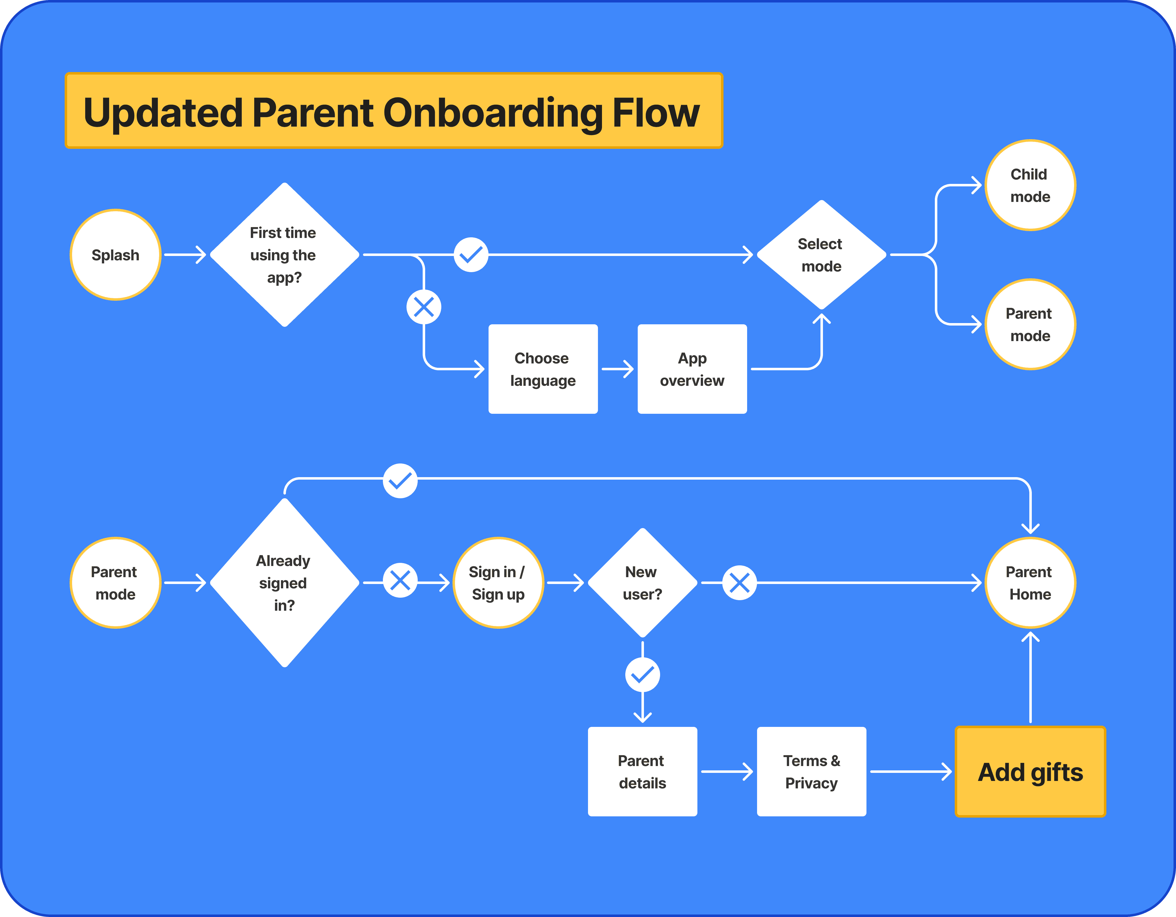
the new flow: Making gift selection a mandatory, seamless part of the profile creation process.
To understand the psychology behind this drop-off, I mapped out the parent persona. They weren't ignoring the gift feature out of malice; they were just overwhelmed and needed the app to guide them.
The Solution: Dual-Stream UX
I split the architecture to cater to the specific psychology of both users, ensuring the two apps felt like part of the same family but served completely different functions.
1. The Parent Experience (Utility & Onboarding)
The goal here was frictionless setup.
The "Forced" Reward Loop: I redesigned the onboarding flow so that adding a gift was a core, unavoidable step immediately after adding a child's profile.
Progress at a Glance: I streamlined the dashboard so parents could filter books, track reading progress, and approve contest entries in seconds, respecting their limited time.
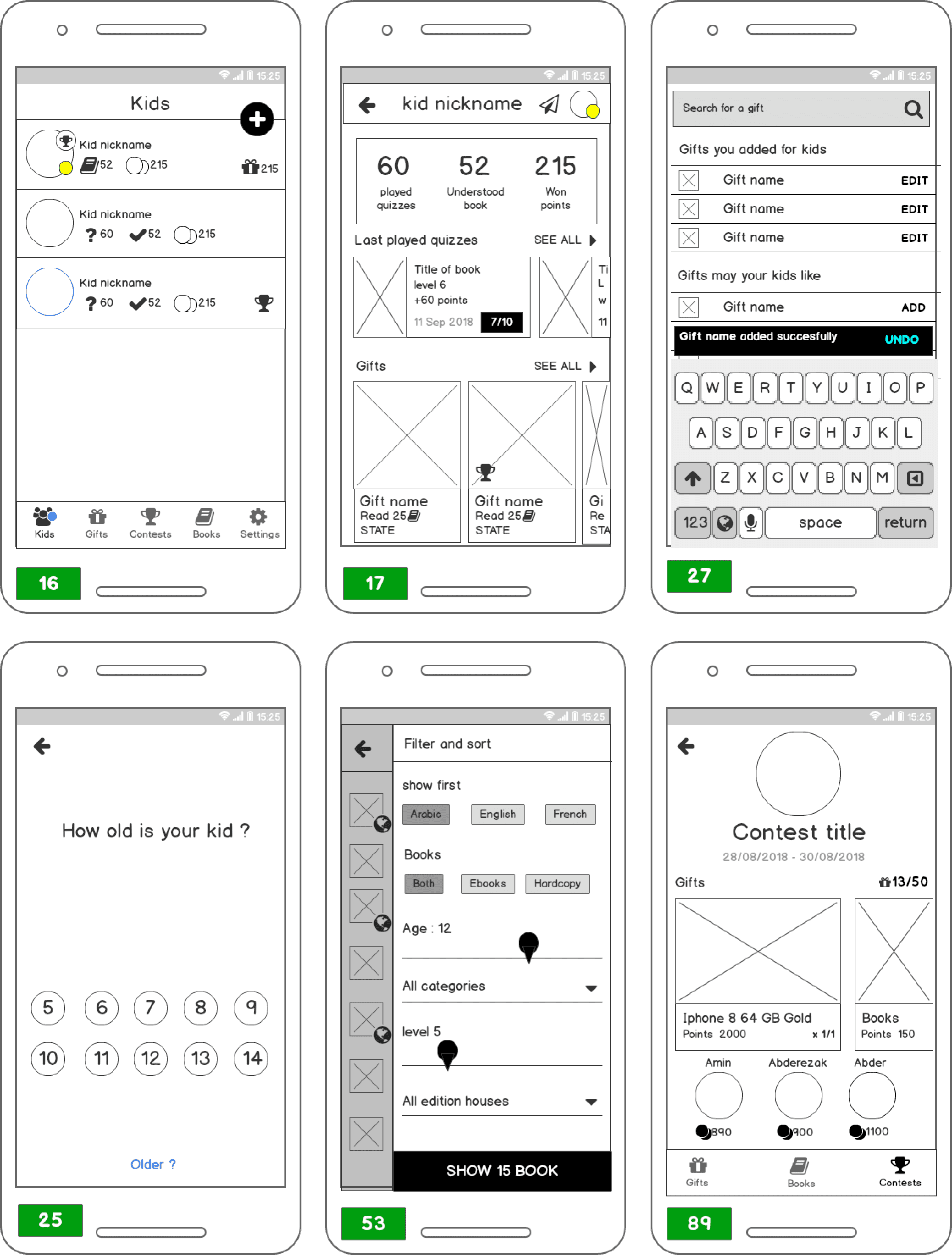


2. The Kid Experience (Play & Motivation)
The original kids' app looked like a standard database. "How do they expect kids to enjoy this?" was my first thought.
Visual Overhaul: I stripped away the generic UI and introduced a vibrant color palette, softer typography, and engaging micro-interactions.
The "Prize" Focus: I restructured the Information Architecture to make the "Gift Catalog" and "Earned Coins" the focal points. Kids could easily see how close they were to winning their chosen gift, turning reading into an active game rather than a chore.

The final Kids UI: Shifting the focus from a "reading database" to a gamified reward center.
The Impact
By aligning the business goal (retention) with the users' psychological needs (motivation for kids, speed for parents), the redesign delivered immediate structural improvements:
+3 Gifts per Onboarding: Parents successfully added an average of 3 gifts immediately after creating a child's profile, fixing the core drop-off leak.
Reduced Churn: Eliminating the "Empty Reward" loop meant kids actually had a reason to return to the app on day two.
Increased DAU (Daily Active Users): The introduction of the new "Reading Competitions" section gave users a reason to log in daily to check leaderboards and progress.
+3 Gifts
+3 Gifts
per Onboarding:
-40%
-40%
in Day-2 Churn
+28%
+28%
Daily Active Users (DAU)
More Projects


UI / UX Design
Gamifying Literacy: Fixing the "Empty Reward" Loop in EdTech
Eurl Kitabquiz had a brilliant concept: kids take quizzes on books to earn points for real-world gifts chosen by their parents. But the product was bleeding users. I led the UX/UI redesign to bridge the gap between a parent’s busy schedule and a kid’s need for instant motivation.
Industry :
EdTech / Mobile
Client :
Eurl Kitabquiz
Project Duration :
8 weeks
Year :
2017
TLDR
The app suffered massive drop-offs because parents were skipping the "gift selection" during onboarding, leaving kids with zero motivation to read. I redesigned the dual-app experience, restructuring the parent onboarding to guarantee gift creation, while injecting vibrant, playful UI into the kids' interface. The result: parents successfully added an average of 3 gifts on day one, fixing the core retention loop.
The Challenge: The Buyer vs. The User
EdTech products face a unique friction: the person buying the product isn't the one using it. Here, we had two distinct audiences with conflicting needs:
The Parent (The Buyer): They know reading is important, but they are time-poor. They need utility, speed, and automated tracking.
The Kid (The User): They aren't motivated to read by default. They need fun, engagement, and clear rewards (gifts).
The existing product used a generic, "one-size-fits-all" UI library that satisfied neither. It was too clunky for parents and too boring for kids.
The Audit: Finding the "Zero Gift" Churn
Before sketching a single screen, I sat down with the CTO to look at the data and answer one critical question: Where exactly are users dropping off?
The data pointed to a fatal flaw in the Parent Onboarding.
The Friction: The original flow asked parents to add their child's profile, but made adding a gift a secondary, hidden action.
The Impact: Parents were setting up profiles but leaving the "Gift Vault" empty. When the kid logged in, there was no reward to work toward. No reward meant no quizzes. No quizzes meant churn.
the new flow: Making gift selection a mandatory, seamless part of the profile creation process.
To understand the psychology behind this drop-off, I mapped out the parent persona. They weren't ignoring the gift feature out of malice; they were just overwhelmed and needed the app to guide them.
The Solution: Dual-Stream UX
I split the architecture to cater to the specific psychology of both users, ensuring the two apps felt like part of the same family but served completely different functions.
1. The Parent Experience (Utility & Onboarding)
The goal here was frictionless setup.
The "Forced" Reward Loop: I redesigned the onboarding flow so that adding a gift was a core, unavoidable step immediately after adding a child's profile.
Progress at a Glance: I streamlined the dashboard so parents could filter books, track reading progress, and approve contest entries in seconds, respecting their limited time.
2. The Kid Experience (Play & Motivation)
The original kids' app looked like a standard database. "How do they expect kids to enjoy this?" was my first thought.
Visual Overhaul: I stripped away the generic UI and introduced a vibrant color palette, softer typography, and engaging micro-interactions.
The "Prize" Focus: I restructured the Information Architecture to make the "Gift Catalog" and "Earned Coins" the focal points. Kids could easily see how close they were to winning their chosen gift, turning reading into an active game rather than a chore.
The final Kids UI: Shifting the focus from a "reading database" to a gamified reward center.
The Impact
By aligning the business goal (retention) with the users' psychological needs (motivation for kids, speed for parents), the redesign delivered immediate structural improvements:
+3 Gifts per Onboarding: Parents successfully added an average of 3 gifts immediately after creating a child's profile, fixing the core drop-off leak.
Reduced Churn: Eliminating the "Empty Reward" loop meant kids actually had a reason to return to the app on day two.
Increased DAU (Daily Active Users): The introduction of the new "Reading Competitions" section gave users a reason to log in daily to check leaderboards and progress.
+3 Gifts
+3 Gifts
per Onboarding:
-40%
-40%
in Day-2 Churn
+28%
+28%
Daily Active Users (DAU)
More Projects
UI / UX Design
Gamifying Literacy: Fixing the "Empty Reward" Loop in EdTech
Eurl Kitabquiz had a brilliant concept: kids take quizzes on books to earn points for real-world gifts chosen by their parents. But the product was bleeding users. I led the UX/UI redesign to bridge the gap between a parent’s busy schedule and a kid’s need for instant motivation.
Industry :
EdTech / Mobile
Client :
Eurl Kitabquiz
Project Duration :
8 weeks
Year :
2017
TLDR
The app suffered massive drop-offs because parents were skipping the "gift selection" during onboarding, leaving kids with zero motivation to read. I redesigned the dual-app experience, restructuring the parent onboarding to guarantee gift creation, while injecting vibrant, playful UI into the kids' interface. The result: parents successfully added an average of 3 gifts on day one, fixing the core retention loop.
The Challenge: The Buyer vs. The User
EdTech products face a unique friction: the person buying the product isn't the one using it. Here, we had two distinct audiences with conflicting needs:
The Parent (The Buyer): They know reading is important, but they are time-poor. They need utility, speed, and automated tracking.
The Kid (The User): They aren't motivated to read by default. They need fun, engagement, and clear rewards (gifts).
The existing product used a generic, "one-size-fits-all" UI library that satisfied neither. It was too clunky for parents and too boring for kids.
The Audit: Finding the "Zero Gift" Churn
Before sketching a single screen, I sat down with the CTO to look at the data and answer one critical question: Where exactly are users dropping off?
The data pointed to a fatal flaw in the Parent Onboarding.
The Friction: The original flow asked parents to add their child's profile, but made adding a gift a secondary, hidden action.
The Impact: Parents were setting up profiles but leaving the "Gift Vault" empty. When the kid logged in, there was no reward to work toward. No reward meant no quizzes. No quizzes meant churn.
the new flow: Making gift selection a mandatory, seamless part of the profile creation process.
To understand the psychology behind this drop-off, I mapped out the parent persona. They weren't ignoring the gift feature out of malice; they were just overwhelmed and needed the app to guide them.
The Solution: Dual-Stream UX
I split the architecture to cater to the specific psychology of both users, ensuring the two apps felt like part of the same family but served completely different functions.
1. The Parent Experience (Utility & Onboarding)
The goal here was frictionless setup.
The "Forced" Reward Loop: I redesigned the onboarding flow so that adding a gift was a core, unavoidable step immediately after adding a child's profile.
Progress at a Glance: I streamlined the dashboard so parents could filter books, track reading progress, and approve contest entries in seconds, respecting their limited time.
2. The Kid Experience (Play & Motivation)
The original kids' app looked like a standard database. "How do they expect kids to enjoy this?" was my first thought.
Visual Overhaul: I stripped away the generic UI and introduced a vibrant color palette, softer typography, and engaging micro-interactions.
The "Prize" Focus: I restructured the Information Architecture to make the "Gift Catalog" and "Earned Coins" the focal points. Kids could easily see how close they were to winning their chosen gift, turning reading into an active game rather than a chore.
The final Kids UI: Shifting the focus from a "reading database" to a gamified reward center.
The Impact
By aligning the business goal (retention) with the users' psychological needs (motivation for kids, speed for parents), the redesign delivered immediate structural improvements:
+3 Gifts per Onboarding: Parents successfully added an average of 3 gifts immediately after creating a child's profile, fixing the core drop-off leak.
Reduced Churn: Eliminating the "Empty Reward" loop meant kids actually had a reason to return to the app on day two.
Increased DAU (Daily Active Users): The introduction of the new "Reading Competitions" section gave users a reason to log in daily to check leaderboards and progress.
+3 Gifts
+3 Gifts
per Onboarding:
-40%
-40%
in Day-2 Churn
+28%
+28%
Daily Active Users (DAU)