UI / UX Design
Operational Clarity: Redesigning Complex Role-Based Workflows for Arabic EdTech
HAD Edutech needed to launch a B2B dashboard for university teachers but was stuck with a legacy system that confused users and a "design stage" prototype that was visually noisy and structurally flawed. In a 3-week sprint, I audited the friction points, decoupled the Information Architecture (IA), and established an accessible "Micro-System" of ~15 components. The result was a role-specific dashboard that prioritized teacher actions over administrative bloat.
Industry :
EdTech B2B SaaS
Client :
HAD Technologies
Project Duration :
3 weeks
Year :
2024
TLDR
HAD Edutech needed to launch a B2B dashboard for university teachers but was stuck with a legacy system that confused users and a "design stage" prototype that was visually noisy and structurally flawed. In a 3-week sprint, I audited the friction points, decoupled the Information Architecture (IA), and established an accessible "Micro-System" of ~15 components. The result was a role-specific dashboard that prioritized teacher actions over administrative bloat.
The Context: A Pivot Without a Platform
I had worked with HAD back in 2019 on their B2C app. Fast forward to 2024, and they were scaling up to offer universities a complete management ecosystem.
They reached out with a critical problem: The dashboard was "functional" but unusable. They had a legacy version (built like a 2010 WordPress admin) and a "Design Stage" prototype that was visually modern but structurally broken. With a tight deadline looming, they didn't need a total reinvention; they needed a rescue mission.
My Constraint: Focus exclusively on the Teacher Role. We had to cut the noise and define exactly what a teacher needed to do versus a super-admin.
The Audit: Decoding the "Feature Factory"
I started by auditing both the Legacy product and the ongoing Design files. The issues weren't just aesthetic; they were deep architectural flaws that made daily tasks painful.
1. The Legacy "Purple Maze"
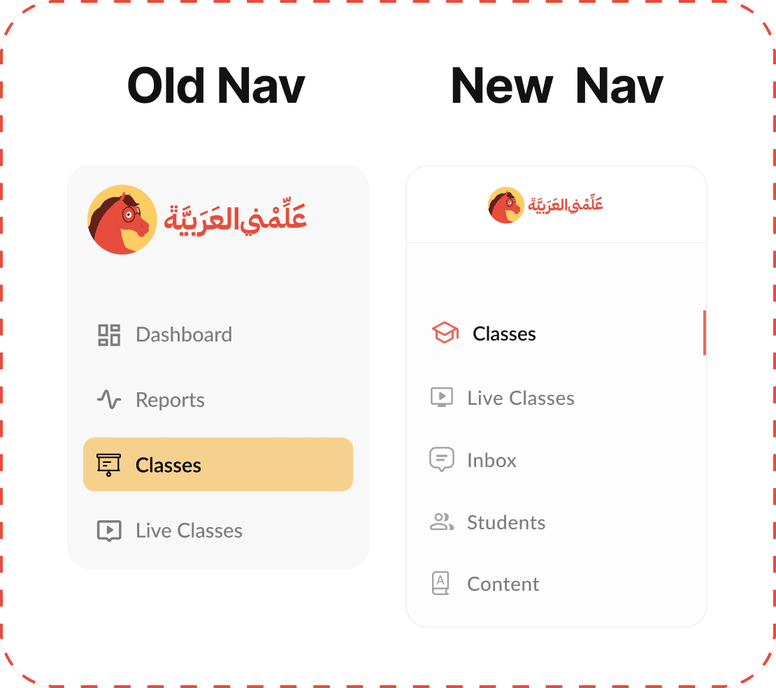
The existing live dashboard was riddled with ambiguous navigation. For example: the sidebar listed "Live Classes" three separate times under different headers. Teachers had to guess which link allowed them to actually start a class.

2. The "Design Stage" Disconnect
The previous designer had created a file that looked "finished" but failed basic logic tests.
Visual Noise vs Utility
The design failed to match the user's mental model.
The Clutter: A massive Daily Calendar and Curriculum table dominated the view, despite being irrelevant for teachers with sparse schedules.
The Gap: The "Assignments" feature was a dead end. While it appeared on the dashboard design, it wasn't scoped for the initial release, leaving early users with a core daily tool that was visible but broken
Hierarchy Errors:
Misplaced Title: The Class Title sat below the tabs, obscuring the page context.
Nested Logic Flaw: The "Curriculum" was buried inside the "Classes" tab. This defied the system logic: Curriculums are global resources shared across levels, not unique properties of a single class.
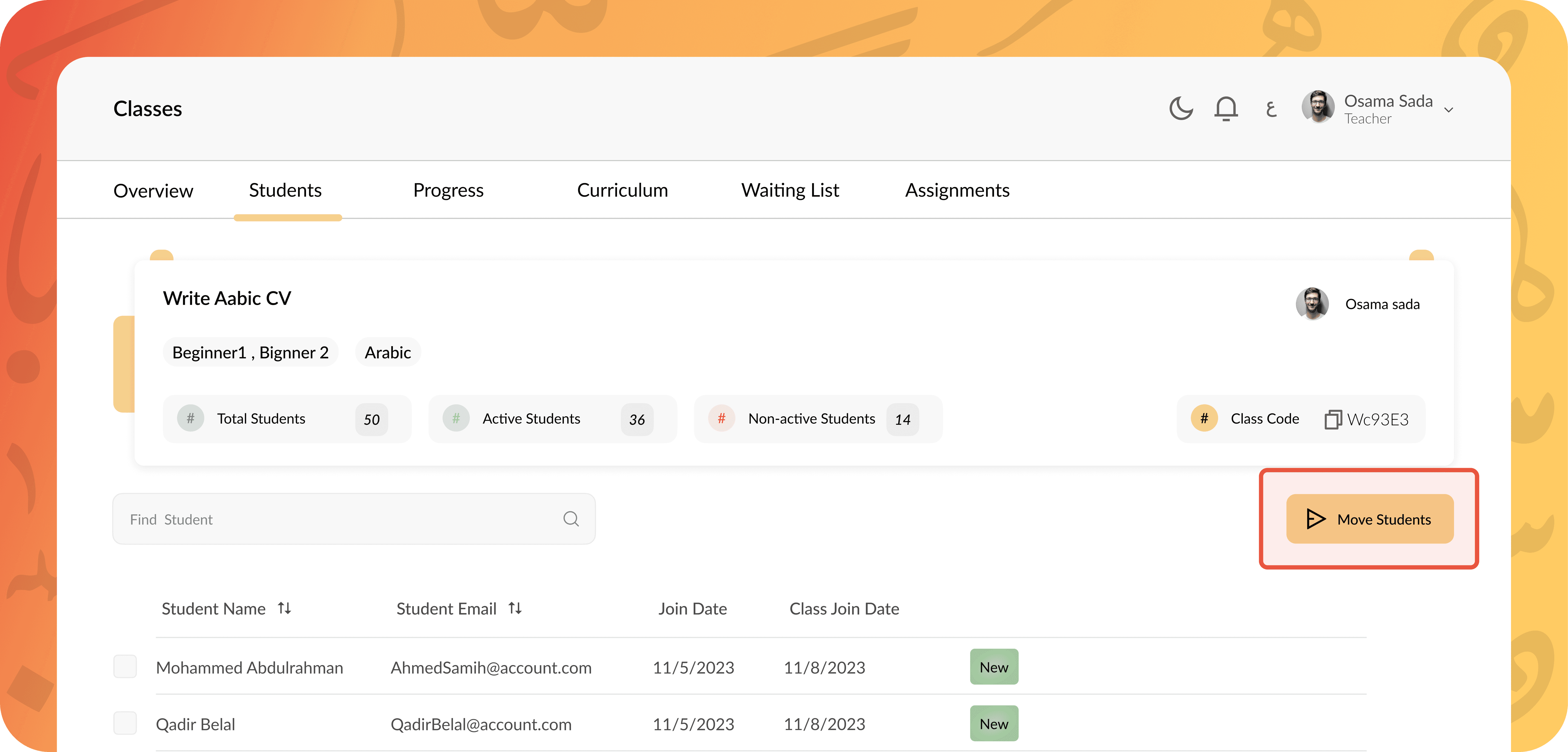
Broken Actions: The "Move Students" button was prominent but non-functional unless a student was selected, setting users up for an immediate error state.
Strategic IA: Cutting the Noise & Decoupling Navigation
The biggest usability win didn't come from adding buttons; it came from deleting them. We realized the dashboard was trying to be a "Feature Factory" rather than a tool.
Step 1: The Purge
I worked with the PM to ruthlessly cut unready features like the Assignments module, clearing the board to focus strictly on essentials.
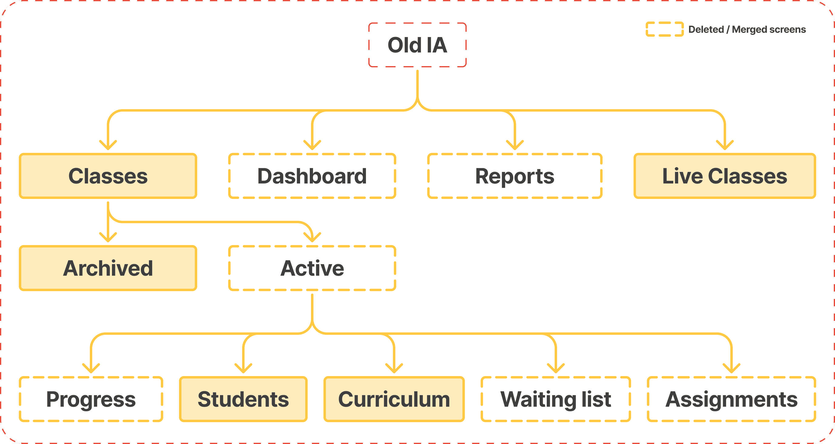
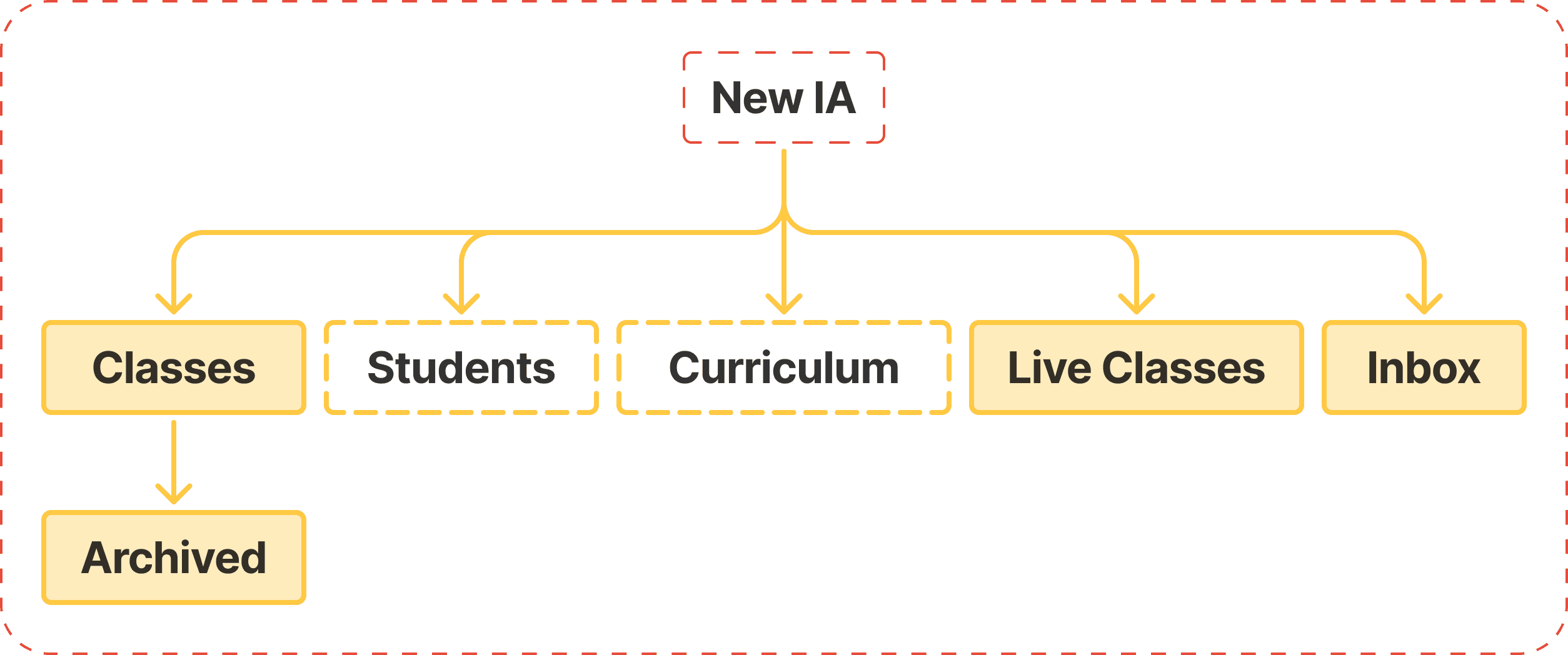
Step 2: The Flattening (Object-Oriented Navigation)
The legacy IA nested everything inside "Classes," treating global objects as if they were local sub-features. I decoupled them to reduce friction.
Curriculum: 6 → 3 clicks from Dashboard to an activity (moved from Class sub-tab → top-level)
Students: 4 → 2 clicks from Dashboard to a student profile (moved out of Class nesting → top-level)
Class stats: 3 → 1–2 clicks from Dashboard (Classes now opens directly into a class; switch class if needed)
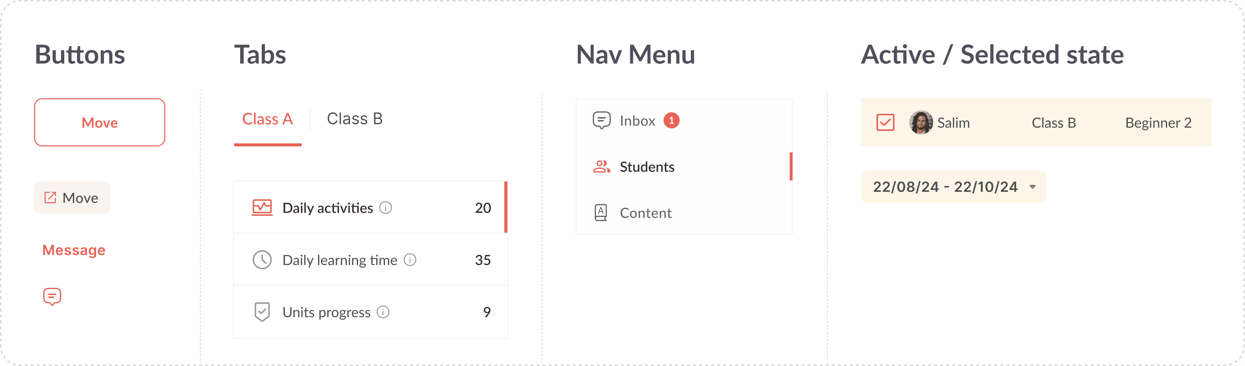
Step 3: Standardizing Navigation Patterns
With the hierarchy flattened, I introduced a standardized "Master Header" layout to handle density without clutter.
Zone 1 (Navigation): Module Title + Main Tabs (Context switching)+ Secondary tabs.
Zone 2 (Action): Search + Filters + Contextual Actions.
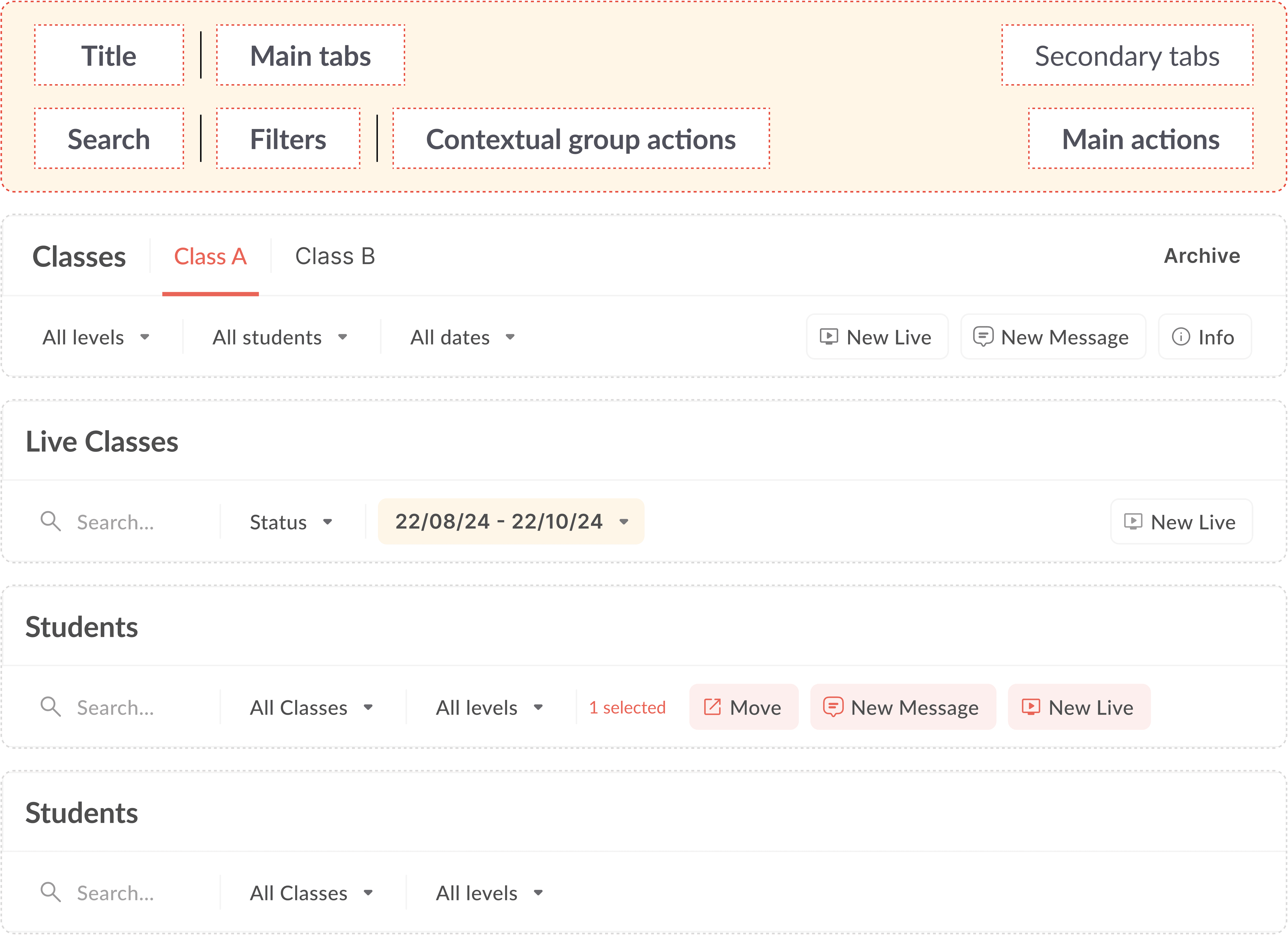
The "Waiting List" Merge: I removed the standalone "Waiting List" tab. Instead, waiting students are now merged into the main list, pinned to the top with a highlighted status. If no one is waiting, the noise is zero.
Interaction Design: Progressive Disclosure
Teachers manage hundreds of students. The previous design showed actions (Move, Contact) on every single row. It was visual chaos.
I handled it by applying the principle of Progressive Disclosure. Information should only appear when the user intends to act on it.
Hover Actions: I hid secondary actions like "Contact Student" behind a hover state on the table row.
Contextual Menus: For the "Move Student" feature, I removed the always-visible button that caused errors. Instead, a "Bulk Action Bar" now slides up only after a teacher selects a student checkbox.
Visual Craft: Taming the Brand
HAD’s brand identity is energetic, saturated reds and warm yellows. Great for a marketing site, but a readability nightmare for a dashboard. I had to bring their identity to life without blinding the user.
The Color Logic (Red & Yellow)
I enforced a strict "No Flash" policy:
I used the brand red for outlined or ghost buttons to keep the UI airy.
For focus states, like active filters or selected rows, I used a low-opacity yellow wash, ensuring data remained legible.

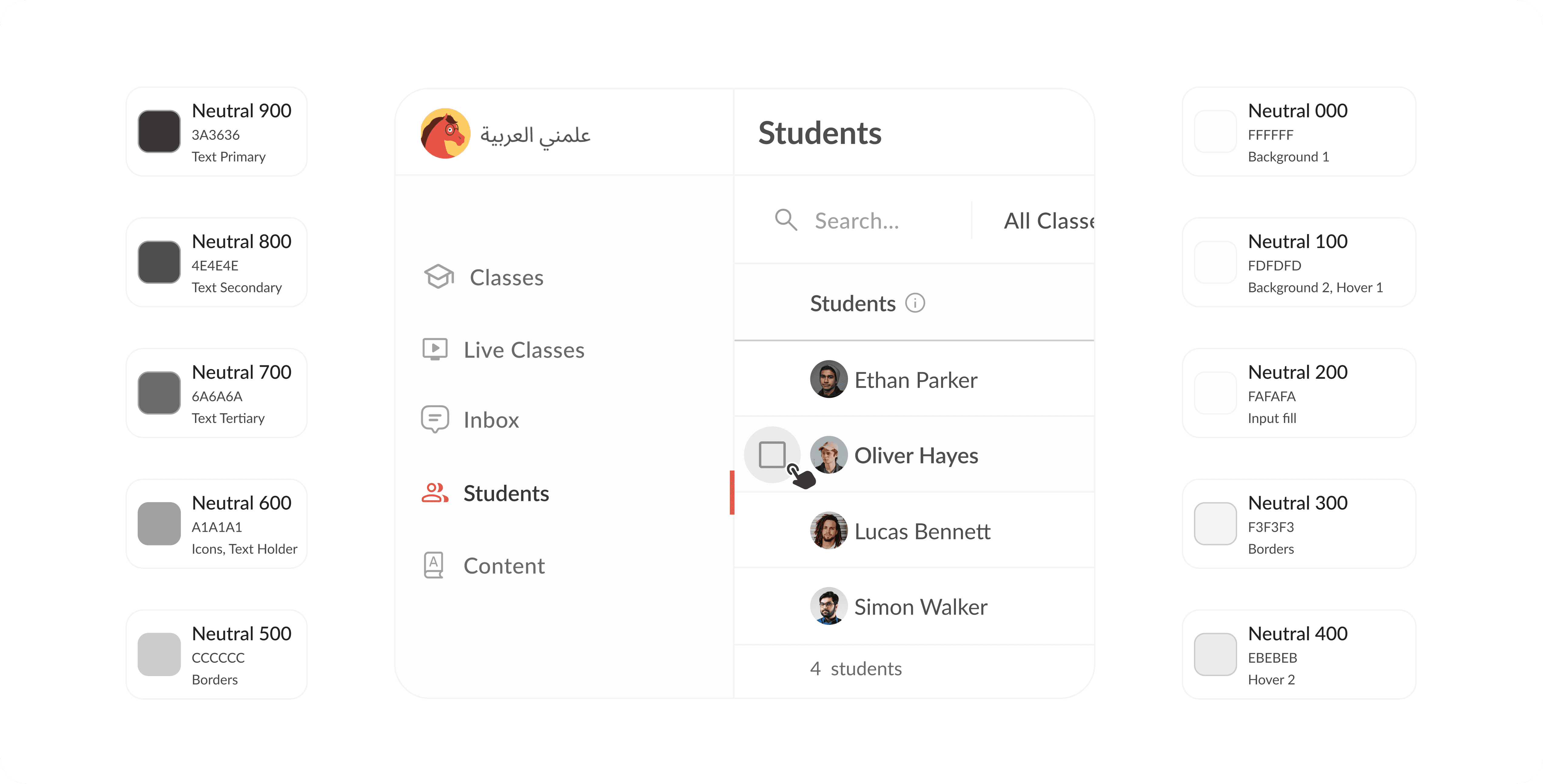
The Grey Scale Challenge
The real battle wasn't the color; it was the absence of it. Since 90% of the interface is monochrome, I had to define a rigorous Slate Gray palette. I needed distinct shades for background levels (Surface 1 vs. Surface 2), hover states, disabled inputs, and neutral actions. It’s a very thin line, if a user can't instantly distinguish a "Disabled" button from a "Secondary" one, the interface fails.
Delivery: The "Lean" System
We didn't have time for a full Design System. The developers were under pressure and needed clarity, not complexity.
The ~15 Component limit I ruthlessly simplified the UI into a "Micro-System."
Universal Table: One master table component that handled students, grades, and attendance.
Master header: A standardized, two-zone header that kept navigation and actions consistent.
The Side menu: A hybrid navigation bar that allowed switching between users and modules without leaving the page.
Charts: Instead of custom designs, I styled standard Chart.js components to match the brand colors, saving dev time.

Results & Learnings
This project wasn't about reinventing the wheel; it was about removing the friction that prevented the wheel from turning.
Efficiency: Task completion clicks reduced by ~50% (e.g., viewing student details dropped from 3 clicks to 1).
Clarity: Developers received a "Dev-Ready" file where every toggle and state was defined, eliminating the guesswork of the previous "Design Stage."
Role Focus: By removing "Super Admin" features (like global analytics) from the Teacher view, we created a workspace that felt dedicated, not diluted.
-50% clicks
-50% clicks
for task completion
-50% components
-50% components
App MVP design completed
16 user flow
16 user flow
teacher specific userflows
Takeaway
I learned that in B2B design, subtraction is a superpower. The previous designs failed because they tried to show everything at once. By hiding actions until they were needed and respecting the specific needs of the "Teacher" persona, we turned a chaotic admin panel into a focused operational tool.
More Projects


UI / UX Design
Operational Clarity: Redesigning Complex Role-Based Workflows for Arabic EdTech
HAD Edutech needed to launch a B2B dashboard for university teachers but was stuck with a legacy system that confused users and a "design stage" prototype that was visually noisy and structurally flawed. In a 3-week sprint, I audited the friction points, decoupled the Information Architecture (IA), and established an accessible "Micro-System" of ~15 components. The result was a role-specific dashboard that prioritized teacher actions over administrative bloat.
Industry :
EdTech B2B SaaS
Client :
HAD Technologies
Project Duration :
3 weeks
Year :
2024
TLDR
HAD Edutech needed to launch a B2B dashboard for university teachers but was stuck with a legacy system that confused users and a "design stage" prototype that was visually noisy and structurally flawed. In a 3-week sprint, I audited the friction points, decoupled the Information Architecture (IA), and established an accessible "Micro-System" of ~15 components. The result was a role-specific dashboard that prioritized teacher actions over administrative bloat.
The Context: A Pivot Without a Platform
I had worked with HAD back in 2019 on their B2C app. Fast forward to 2024, and they were scaling up to offer universities a complete management ecosystem.
They reached out with a critical problem: The dashboard was "functional" but unusable. They had a legacy version (built like a 2010 WordPress admin) and a "Design Stage" prototype that was visually modern but structurally broken. With a tight deadline looming, they didn't need a total reinvention; they needed a rescue mission.
My Constraint: Focus exclusively on the Teacher Role. We had to cut the noise and define exactly what a teacher needed to do versus a super-admin.
The Audit: Decoding the "Feature Factory"
I started by auditing both the Legacy product and the ongoing Design files. The issues weren't just aesthetic; they were deep architectural flaws that made daily tasks painful.
1. The Legacy "Purple Maze"
The existing live dashboard was riddled with ambiguous navigation. For example: the sidebar listed "Live Classes" three separate times under different headers. Teachers had to guess which link allowed them to actually start a class.
2. The "Design Stage" Disconnect
The previous designer had created a file that looked "finished" but failed basic logic tests.
Visual Noise vs Utility
The design failed to match the user's mental model.
The Clutter: A massive Daily Calendar and Curriculum table dominated the view, despite being irrelevant for teachers with sparse schedules.
The Gap: The "Assignments" feature was a dead end. While it appeared on the dashboard design, it wasn't scoped for the initial release, leaving early users with a core daily tool that was visible but broken
Hierarchy Errors:
Misplaced Title: The Class Title sat below the tabs, obscuring the page context.
Nested Logic Flaw: The "Curriculum" was buried inside the "Classes" tab. This defied the system logic: Curriculums are global resources shared across levels, not unique properties of a single class.
Broken Actions: The "Move Students" button was prominent but non-functional unless a student was selected, setting users up for an immediate error state.
Strategic IA: Cutting the Noise & Decoupling Navigation
The biggest usability win didn't come from adding buttons; it came from deleting them. We realized the dashboard was trying to be a "Feature Factory" rather than a tool.
Step 1: The Purge
I worked with the PM to ruthlessly cut unready features like the Assignments module, clearing the board to focus strictly on essentials.
Step 2: The Flattening (Object-Oriented Navigation)
The legacy IA nested everything inside "Classes," treating global objects as if they were local sub-features. I decoupled them to reduce friction.
Curriculum: 6 → 3 clicks from Dashboard to an activity (moved from Class sub-tab → top-level)
Students: 4 → 2 clicks from Dashboard to a student profile (moved out of Class nesting → top-level)
Class stats: 3 → 1–2 clicks from Dashboard (Classes now opens directly into a class; switch class if needed)
Step 3: Standardizing Navigation Patterns
With the hierarchy flattened, I introduced a standardized "Master Header" layout to handle density without clutter.
Zone 1 (Navigation): Module Title + Main Tabs (Context switching)+ Secondary tabs.
Zone 2 (Action): Search + Filters + Contextual Actions.
The "Waiting List" Merge: I removed the standalone "Waiting List" tab. Instead, waiting students are now merged into the main list, pinned to the top with a highlighted status. If no one is waiting, the noise is zero.
Interaction Design: Progressive Disclosure
Teachers manage hundreds of students. The previous design showed actions (Move, Contact) on every single row. It was visual chaos.
I handled it by applying the principle of Progressive Disclosure. Information should only appear when the user intends to act on it.
Hover Actions: I hid secondary actions like "Contact Student" behind a hover state on the table row.
Contextual Menus: For the "Move Student" feature, I removed the always-visible button that caused errors. Instead, a "Bulk Action Bar" now slides up only after a teacher selects a student checkbox.
Visual Craft: Taming the Brand
HAD’s brand identity is energetic, saturated reds and warm yellows. Great for a marketing site, but a readability nightmare for a dashboard. I had to bring their identity to life without blinding the user.
The Color Logic (Red & Yellow)
I enforced a strict "No Flash" policy:
I used the brand red for outlined or ghost buttons to keep the UI airy.
For focus states, like active filters or selected rows, I used a low-opacity yellow wash, ensuring data remained legible.
The Grey Scale Challenge
The real battle wasn't the color; it was the absence of it. Since 90% of the interface is monochrome, I had to define a rigorous Slate Gray palette. I needed distinct shades for background levels (Surface 1 vs. Surface 2), hover states, disabled inputs, and neutral actions. It’s a very thin line, if a user can't instantly distinguish a "Disabled" button from a "Secondary" one, the interface fails.
Delivery: The "Lean" System
We didn't have time for a full Design System. The developers were under pressure and needed clarity, not complexity.
The ~15 Component limit I ruthlessly simplified the UI into a "Micro-System."
Universal Table: One master table component that handled students, grades, and attendance.
Master header: A standardized, two-zone header that kept navigation and actions consistent.
The Side menu: A hybrid navigation bar that allowed switching between users and modules without leaving the page.
Charts: Instead of custom designs, I styled standard Chart.js components to match the brand colors, saving dev time.
Results & Learnings
This project wasn't about reinventing the wheel; it was about removing the friction that prevented the wheel from turning.
Efficiency: Task completion clicks reduced by ~50% (e.g., viewing student details dropped from 3 clicks to 1).
Clarity: Developers received a "Dev-Ready" file where every toggle and state was defined, eliminating the guesswork of the previous "Design Stage."
Role Focus: By removing "Super Admin" features (like global analytics) from the Teacher view, we created a workspace that felt dedicated, not diluted.
-50% clicks
-50% clicks
for task completion
-50% components
-50% components
App MVP design completed
16 user flow
16 user flow
teacher specific userflows
Takeaway
I learned that in B2B design, subtraction is a superpower. The previous designs failed because they tried to show everything at once. By hiding actions until they were needed and respecting the specific needs of the "Teacher" persona, we turned a chaotic admin panel into a focused operational tool.
More Projects
UI / UX Design
Operational Clarity: Redesigning Complex Role-Based Workflows for Arabic EdTech
HAD Edutech needed to launch a B2B dashboard for university teachers but was stuck with a legacy system that confused users and a "design stage" prototype that was visually noisy and structurally flawed. In a 3-week sprint, I audited the friction points, decoupled the Information Architecture (IA), and established an accessible "Micro-System" of ~15 components. The result was a role-specific dashboard that prioritized teacher actions over administrative bloat.
Industry :
EdTech B2B SaaS
Client :
HAD Technologies
Project Duration :
3 weeks
Year :
2024
TLDR
HAD Edutech needed to launch a B2B dashboard for university teachers but was stuck with a legacy system that confused users and a "design stage" prototype that was visually noisy and structurally flawed. In a 3-week sprint, I audited the friction points, decoupled the Information Architecture (IA), and established an accessible "Micro-System" of ~15 components. The result was a role-specific dashboard that prioritized teacher actions over administrative bloat.
The Context: A Pivot Without a Platform
I had worked with HAD back in 2019 on their B2C app. Fast forward to 2024, and they were scaling up to offer universities a complete management ecosystem.
They reached out with a critical problem: The dashboard was "functional" but unusable. They had a legacy version (built like a 2010 WordPress admin) and a "Design Stage" prototype that was visually modern but structurally broken. With a tight deadline looming, they didn't need a total reinvention; they needed a rescue mission.
My Constraint: Focus exclusively on the Teacher Role. We had to cut the noise and define exactly what a teacher needed to do versus a super-admin.
The Audit: Decoding the "Feature Factory"
I started by auditing both the Legacy product and the ongoing Design files. The issues weren't just aesthetic; they were deep architectural flaws that made daily tasks painful.
1. The Legacy "Purple Maze"
The existing live dashboard was riddled with ambiguous navigation. For example: the sidebar listed "Live Classes" three separate times under different headers. Teachers had to guess which link allowed them to actually start a class.
2. The "Design Stage" Disconnect
The previous designer had created a file that looked "finished" but failed basic logic tests.
Visual Noise vs Utility
The design failed to match the user's mental model.
The Clutter: A massive Daily Calendar and Curriculum table dominated the view, despite being irrelevant for teachers with sparse schedules.
The Gap: The "Assignments" feature was a dead end. While it appeared on the dashboard design, it wasn't scoped for the initial release, leaving early users with a core daily tool that was visible but broken
Hierarchy Errors:
Misplaced Title: The Class Title sat below the tabs, obscuring the page context.
Nested Logic Flaw: The "Curriculum" was buried inside the "Classes" tab. This defied the system logic: Curriculums are global resources shared across levels, not unique properties of a single class.
Broken Actions: The "Move Students" button was prominent but non-functional unless a student was selected, setting users up for an immediate error state.
Strategic IA: Cutting the Noise & Decoupling Navigation
The biggest usability win didn't come from adding buttons; it came from deleting them. We realized the dashboard was trying to be a "Feature Factory" rather than a tool.
Step 1: The Purge
I worked with the PM to ruthlessly cut unready features like the Assignments module, clearing the board to focus strictly on essentials.
Step 2: The Flattening (Object-Oriented Navigation)
The legacy IA nested everything inside "Classes," treating global objects as if they were local sub-features. I decoupled them to reduce friction.
Curriculum: 6 → 3 clicks from Dashboard to an activity (moved from Class sub-tab → top-level)
Students: 4 → 2 clicks from Dashboard to a student profile (moved out of Class nesting → top-level)
Class stats: 3 → 1–2 clicks from Dashboard (Classes now opens directly into a class; switch class if needed)
Step 3: Standardizing Navigation Patterns
With the hierarchy flattened, I introduced a standardized "Master Header" layout to handle density without clutter.
Zone 1 (Navigation): Module Title + Main Tabs (Context switching)+ Secondary tabs.
Zone 2 (Action): Search + Filters + Contextual Actions.
The "Waiting List" Merge: I removed the standalone "Waiting List" tab. Instead, waiting students are now merged into the main list, pinned to the top with a highlighted status. If no one is waiting, the noise is zero.
Interaction Design: Progressive Disclosure
Teachers manage hundreds of students. The previous design showed actions (Move, Contact) on every single row. It was visual chaos.
I handled it by applying the principle of Progressive Disclosure. Information should only appear when the user intends to act on it.
Hover Actions: I hid secondary actions like "Contact Student" behind a hover state on the table row.
Contextual Menus: For the "Move Student" feature, I removed the always-visible button that caused errors. Instead, a "Bulk Action Bar" now slides up only after a teacher selects a student checkbox.
Visual Craft: Taming the Brand
HAD’s brand identity is energetic, saturated reds and warm yellows. Great for a marketing site, but a readability nightmare for a dashboard. I had to bring their identity to life without blinding the user.
The Color Logic (Red & Yellow)
I enforced a strict "No Flash" policy:
I used the brand red for outlined or ghost buttons to keep the UI airy.
For focus states, like active filters or selected rows, I used a low-opacity yellow wash, ensuring data remained legible.
The Grey Scale Challenge
The real battle wasn't the color; it was the absence of it. Since 90% of the interface is monochrome, I had to define a rigorous Slate Gray palette. I needed distinct shades for background levels (Surface 1 vs. Surface 2), hover states, disabled inputs, and neutral actions. It’s a very thin line, if a user can't instantly distinguish a "Disabled" button from a "Secondary" one, the interface fails.
Delivery: The "Lean" System
We didn't have time for a full Design System. The developers were under pressure and needed clarity, not complexity.
The ~15 Component limit I ruthlessly simplified the UI into a "Micro-System."
Universal Table: One master table component that handled students, grades, and attendance.
Master header: A standardized, two-zone header that kept navigation and actions consistent.
The Side menu: A hybrid navigation bar that allowed switching between users and modules without leaving the page.
Charts: Instead of custom designs, I styled standard Chart.js components to match the brand colors, saving dev time.
Results & Learnings
This project wasn't about reinventing the wheel; it was about removing the friction that prevented the wheel from turning.
Efficiency: Task completion clicks reduced by ~50% (e.g., viewing student details dropped from 3 clicks to 1).
Clarity: Developers received a "Dev-Ready" file where every toggle and state was defined, eliminating the guesswork of the previous "Design Stage."
Role Focus: By removing "Super Admin" features (like global analytics) from the Teacher view, we created a workspace that felt dedicated, not diluted.
-50% clicks
-50% clicks
for task completion
-50% components
-50% components
App MVP design completed
16 user flow
16 user flow
teacher specific userflows
Takeaway
I learned that in B2B design, subtraction is a superpower. The previous designs failed because they tried to show everything at once. By hiding actions until they were needed and respecting the specific needs of the "Teacher" persona, we turned a chaotic admin panel into a focused operational tool.