UI / UX Design
The £2M UX Layer: Simplifying B2B Procurement for a Global Agri-Food Giant
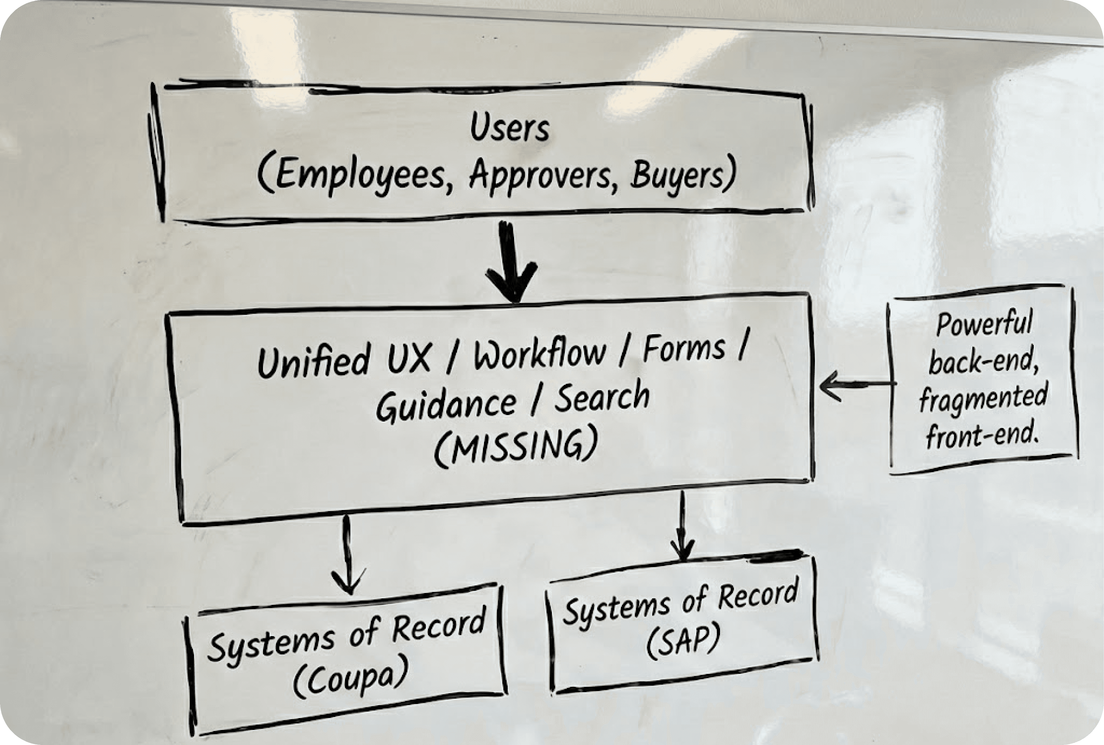
A global agri-food giant had the best software money could buy (Coupa & SAP), but their procurement process was failing. Users found the tools so intimidating they simply bypassed them, causing massive data errors. I joined a McKinsey-led team to design the missing "UX Layer" a unified portal bridging the gap between human needs and rigid legacy systems.
Industry :
Agri-food
Client :
Confidential
Project Duration :
8 weeks
Year :
2024
TLDR
Adoption of the client's procurement tools was failing due to extreme complexity. Embedded within a strategy team, I led the UX research and prototyping of a "One-Stop Shop" portal. By designing AI-assisted workflows that masked the complexity of the backend, I helped define an MVP that is projected to save £2M annually and secured immediate executive approval for the build.
The Challenge: High-End Tools, Zero Usability
The client wasn't suffering from a lack of technology; they were suffering from a lack of usability. They had powerful engines (Coupa for purchasing, SAP for finance), but no steering wheel.
I audited the current experience to understand why users were bypassing these expensive tools. The friction wasn't technical, it was cognitive.
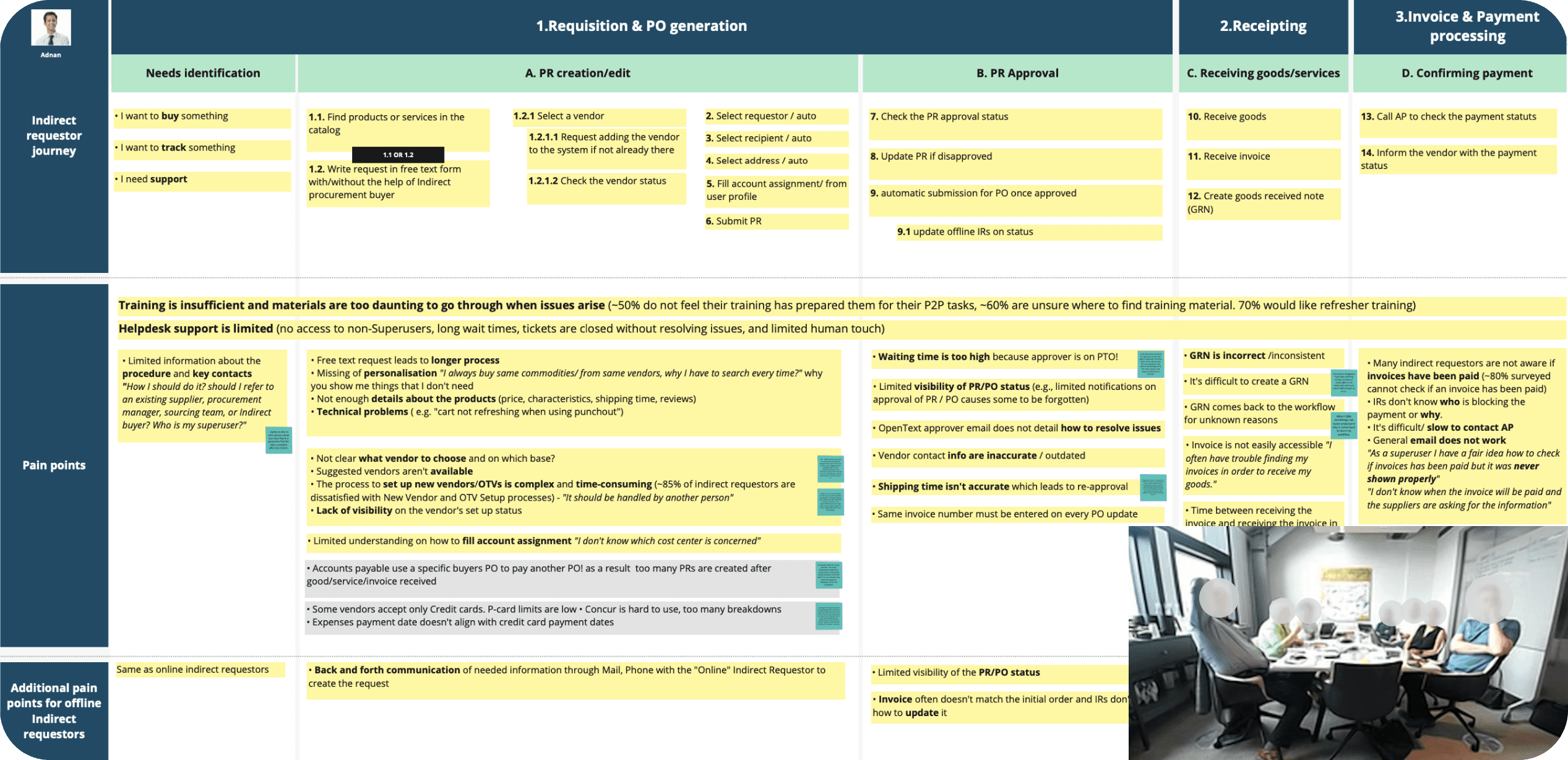
1. The "Daunting" Direct Buyer Experience
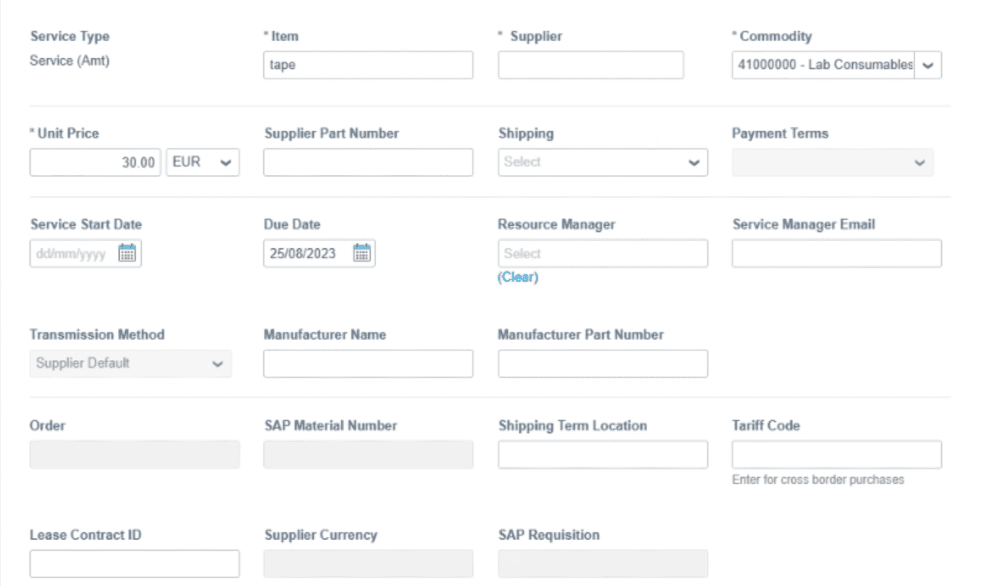
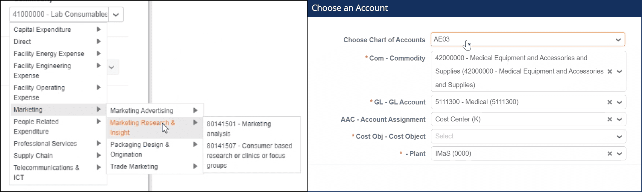
The audit revealed why adoption was low: the interface was a wall of data entry. To raise a simple PO, users had to fill out a grid of technical fields: Service Type, Manufacturer Name, Shipping Terms that had no relevance to their role. Users complained that selecting a simple category required drilling down through four levels of taxonomy, making the tool "too daunting to touch" without a manual.
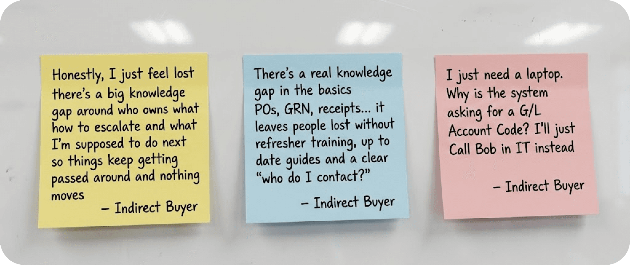
2. The "Lost" Indirect Buyer Employees
Needing simple items (like laptops) felt abandoned. They described AP (Accounts Payable) as a "faceless email address." If they didn't have a personal network to call, they were stuck. They struggled to even choose the relevant category to start a request.
3. The "Black Hole"
Visibility Both groups suffered from the same anxiety: Invoice Mismatches. Users had limited visibility into payment status or GRNs (Goods Received Notes). This caused massive friction with suppliers, leading to angry phone calls and damaged vendor relationships.

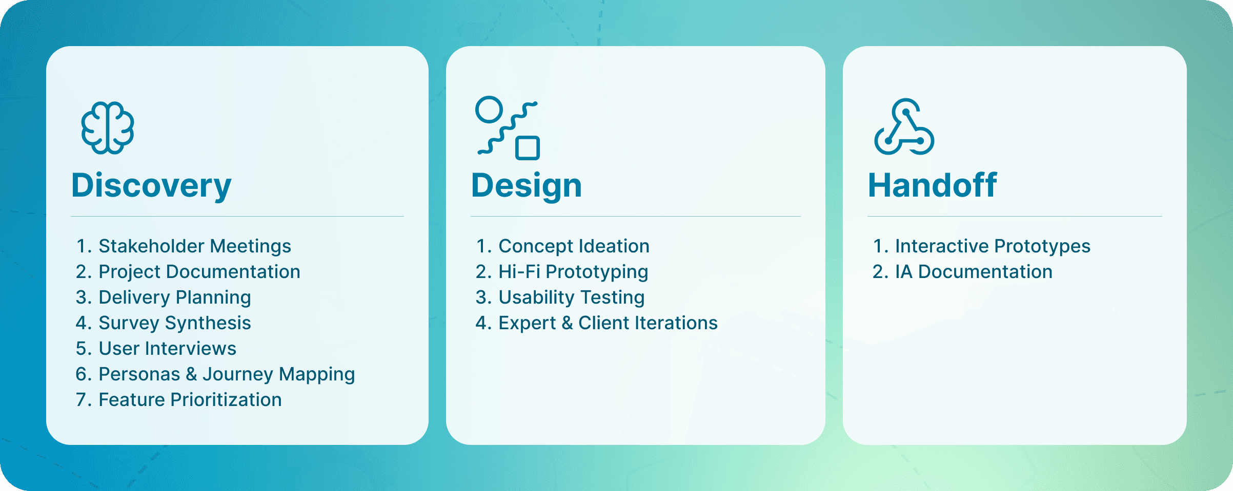
The Craft: Designing the One-Stop Shop
We realized we couldn’t just build a new tool; we had to change behavior. So we ran two streams:
Stream 1 (Soft): Refresh training and help employees find what they need.
Stream 2 (Tech): One portal that simplifies Coupa/SAP through a single layer.
I focused on designing the Stream 2 Portal, which would also serve as the delivery vehicle for Stream 1 content.
Feature 1: Guided RFQ (Request for Quotation)
The Problem: Direct buyers were overwhelmed by 30-field forms in Coupa.
The Solution: A "Free Text" intake. Users could describe their need in natural language (e.g., "Need 50 tons of wheat"). The system would use GenAI to parse that text, map it to the correct category, and auto-fill the rigid Coupa form.
The Impact: This solved the "laziness" factor by allowing users to work naturally while keeping the backend data structured.
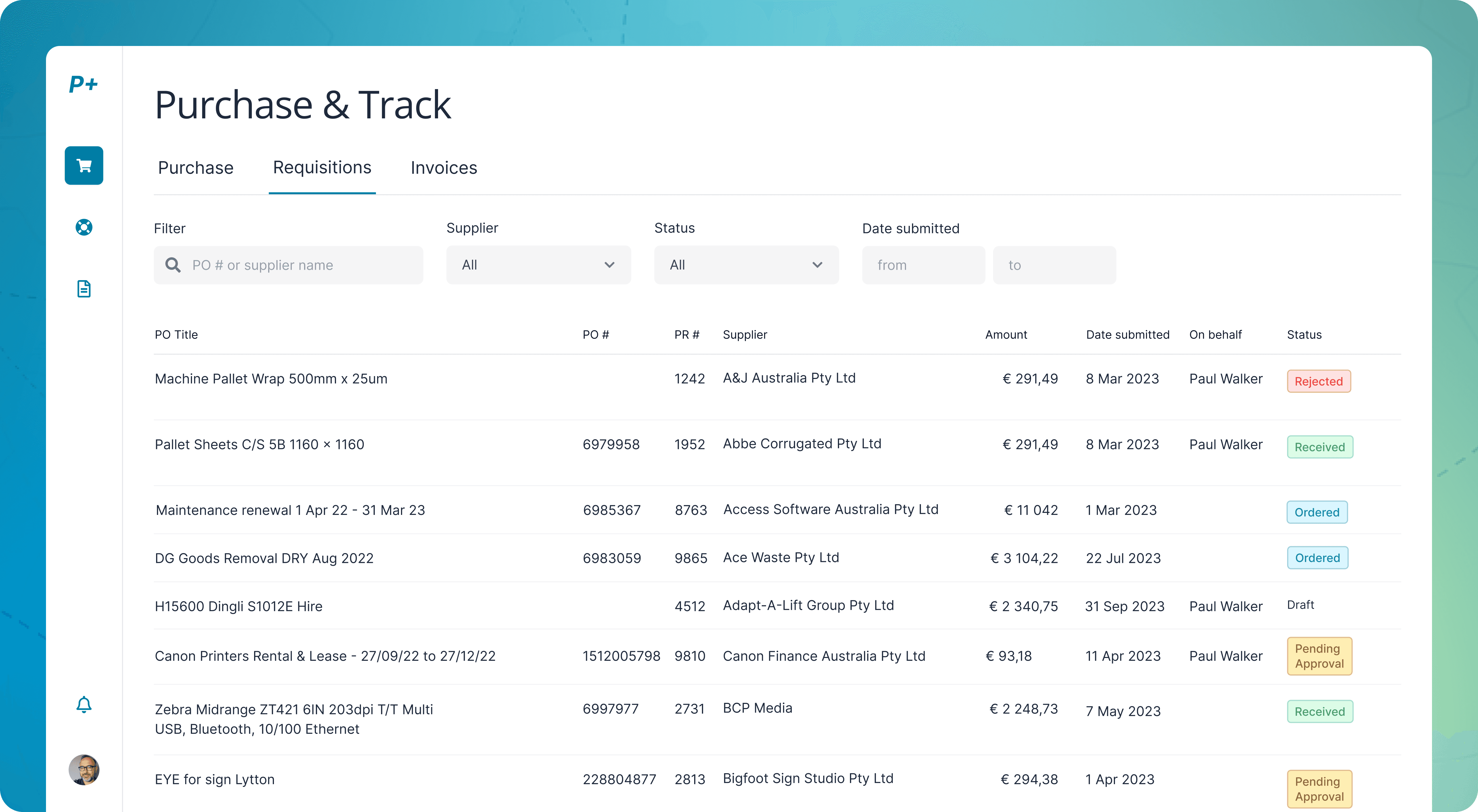
Feature 2: The Unified Tracking System
The Problem: The "Black Hole" of payment status.
The Solution: I designed a "Purchase & Track" dashboard that pulled data from both Coupa (Orders) and SAP (Invoices). It visualized the entire lifecycle in a simple timeline: Submitted → Approved → Supplier Accepted → Invoice Matched → Paid.
The Impact: Users could self-serve status checks instead of emailing AP.
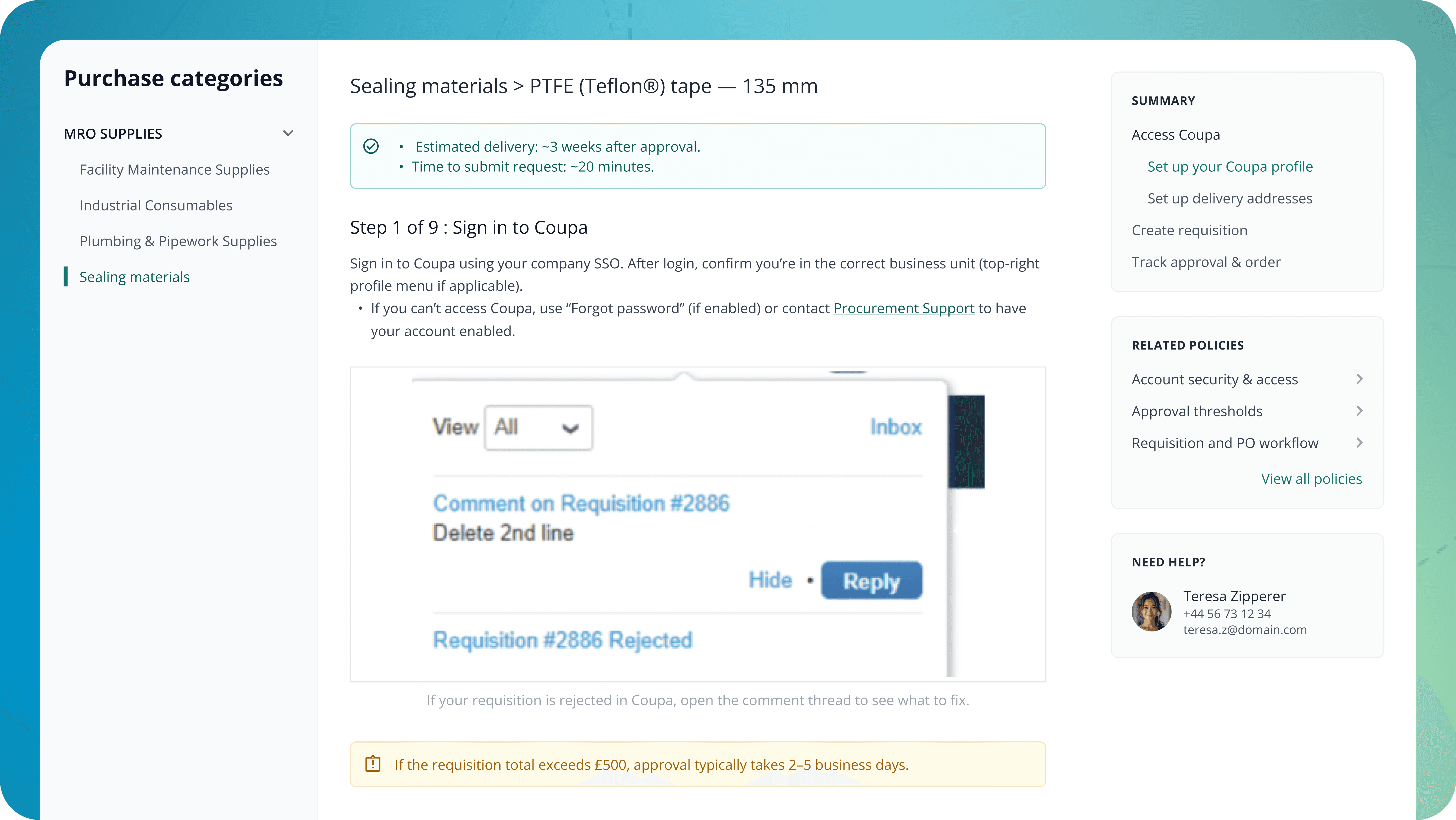
Feature 3: The "Human" Help Portal
The Problem: "Faceless" support.
The Solution: I designed a dashboard that didn't just show tasks; it showed people. Based on the user's login and location, the portal displayed the specific "Key Contacts" for their category.
Key Decisions: Visualizing to Validate
I didn't lead the client workshops, the senior consultants did. But I provided the fuel that made those workshops work.
Mapping the Invisible: When stakeholders argued about abstract "processes," I projected the User Journey map. Pointing to a specific red "Pain Point" block stopped the theoretical debate and focused the room on solving that specific error.
Prioritizing Guidance over Features: The client wanted more features. I used the interview findings to argue for less. We cut "Advanced Analytics" from the MVP to focus entirely on "Guided Buying," proving that users needed hand-holding, not more charts.
Results: From Friction to Flow
By creating a "UX Layer" that sat between the user and the complex backend systems, we transformed the procurement process.
+6pp Increase in "First-Time Pass" rate (orders correct without rework).
£2M Estimated annual savings due to reduced error handling and faster cycles.
Green Light: The high-fidelity prototypes aligned leadership and engineering, securing immediate approval for the build phase.
+6pp
+6pp
First-Time Pass
£2M
£2M
Estimated annual savings
What I Learned
Software isn't a solution; usage is. The client had the best software in the world (Coupa/SAP), but it failed because it ignored human behavior. My job wasn't to replace the software, but to make it approachable.
Visuals are the universal language. In a room full of senior consultants and client executives, a clear Journey Map is more powerful than the smartest spreadsheet. It gave us a shared reality to debate.
Humility in the hierarchy. I learned how to influence without authority. By focusing on "evidence" (user quotes, journey maps) rather than "opinion," I was able to shape the strategy even from a supporting role.
Closing
This project proved that you don't always need to build a new engine to make the car go faster. Sometimes, you just need to design a better steering wheel. We gave employees a "human" interface that handled the complexity for them, turning a source of frustration into a guided workflow.
More Projects


UI / UX Design
The £2M UX Layer: Simplifying B2B Procurement for a Global Agri-Food Giant
A global agri-food giant had the best software money could buy (Coupa & SAP), but their procurement process was failing. Users found the tools so intimidating they simply bypassed them, causing massive data errors. I joined a McKinsey-led team to design the missing "UX Layer" a unified portal bridging the gap between human needs and rigid legacy systems.
Industry :
Agri-food
Client :
Confidential
Project Duration :
8 weeks
Year :
2024
TLDR
Adoption of the client's procurement tools was failing due to extreme complexity. Embedded within a strategy team, I led the UX research and prototyping of a "One-Stop Shop" portal. By designing AI-assisted workflows that masked the complexity of the backend, I helped define an MVP that is projected to save £2M annually and secured immediate executive approval for the build.
The Challenge: High-End Tools, Zero Usability
The client wasn't suffering from a lack of technology; they were suffering from a lack of usability. They had powerful engines (Coupa for purchasing, SAP for finance), but no steering wheel.
I audited the current experience to understand why users were bypassing these expensive tools. The friction wasn't technical, it was cognitive.
1. The "Daunting" Direct Buyer Experience
The audit revealed why adoption was low: the interface was a wall of data entry. To raise a simple PO, users had to fill out a grid of technical fields: Service Type, Manufacturer Name, Shipping Terms that had no relevance to their role. Users complained that selecting a simple category required drilling down through four levels of taxonomy, making the tool "too daunting to touch" without a manual.
2. The "Lost" Indirect Buyer Employees
Needing simple items (like laptops) felt abandoned. They described AP (Accounts Payable) as a "faceless email address." If they didn't have a personal network to call, they were stuck. They struggled to even choose the relevant category to start a request.
3. The "Black Hole"
Visibility Both groups suffered from the same anxiety: Invoice Mismatches. Users had limited visibility into payment status or GRNs (Goods Received Notes). This caused massive friction with suppliers, leading to angry phone calls and damaged vendor relationships.
The Craft: Designing the One-Stop Shop
We realized we couldn’t just build a new tool; we had to change behavior. So we ran two streams:
Stream 1 (Soft): Refresh training and help employees find what they need.
Stream 2 (Tech): One portal that simplifies Coupa/SAP through a single layer.
I focused on designing the Stream 2 Portal, which would also serve as the delivery vehicle for Stream 1 content.
Feature 1: Guided RFQ (Request for Quotation)
The Problem: Direct buyers were overwhelmed by 30-field forms in Coupa.
The Solution: A "Free Text" intake. Users could describe their need in natural language (e.g., "Need 50 tons of wheat"). The system would use GenAI to parse that text, map it to the correct category, and auto-fill the rigid Coupa form.
The Impact: This solved the "laziness" factor by allowing users to work naturally while keeping the backend data structured.
Feature 2: The Unified Tracking System
The Problem: The "Black Hole" of payment status.
The Solution: I designed a "Purchase & Track" dashboard that pulled data from both Coupa (Orders) and SAP (Invoices). It visualized the entire lifecycle in a simple timeline: Submitted → Approved → Supplier Accepted → Invoice Matched → Paid.
The Impact: Users could self-serve status checks instead of emailing AP.
Feature 3: The "Human" Help Portal
The Problem: "Faceless" support.
The Solution: I designed a dashboard that didn't just show tasks; it showed people. Based on the user's login and location, the portal displayed the specific "Key Contacts" for their category.
Key Decisions: Visualizing to Validate
I didn't lead the client workshops, the senior consultants did. But I provided the fuel that made those workshops work.
Mapping the Invisible: When stakeholders argued about abstract "processes," I projected the User Journey map. Pointing to a specific red "Pain Point" block stopped the theoretical debate and focused the room on solving that specific error.
Prioritizing Guidance over Features: The client wanted more features. I used the interview findings to argue for less. We cut "Advanced Analytics" from the MVP to focus entirely on "Guided Buying," proving that users needed hand-holding, not more charts.
Results: From Friction to Flow
By creating a "UX Layer" that sat between the user and the complex backend systems, we transformed the procurement process.
+6pp Increase in "First-Time Pass" rate (orders correct without rework).
£2M Estimated annual savings due to reduced error handling and faster cycles.
Green Light: The high-fidelity prototypes aligned leadership and engineering, securing immediate approval for the build phase.
+6pp
+6pp
First-Time Pass
£2M
£2M
Estimated annual savings
What I Learned
Software isn't a solution; usage is. The client had the best software in the world (Coupa/SAP), but it failed because it ignored human behavior. My job wasn't to replace the software, but to make it approachable.
Visuals are the universal language. In a room full of senior consultants and client executives, a clear Journey Map is more powerful than the smartest spreadsheet. It gave us a shared reality to debate.
Humility in the hierarchy. I learned how to influence without authority. By focusing on "evidence" (user quotes, journey maps) rather than "opinion," I was able to shape the strategy even from a supporting role.
Closing
This project proved that you don't always need to build a new engine to make the car go faster. Sometimes, you just need to design a better steering wheel. We gave employees a "human" interface that handled the complexity for them, turning a source of frustration into a guided workflow.
More Projects
UI / UX Design
The £2M UX Layer: Simplifying B2B Procurement for a Global Agri-Food Giant
A global agri-food giant had the best software money could buy (Coupa & SAP), but their procurement process was failing. Users found the tools so intimidating they simply bypassed them, causing massive data errors. I joined a McKinsey-led team to design the missing "UX Layer" a unified portal bridging the gap between human needs and rigid legacy systems.
Industry :
Agri-food
Client :
Confidential
Project Duration :
8 weeks
Year :
2024
TLDR
Adoption of the client's procurement tools was failing due to extreme complexity. Embedded within a strategy team, I led the UX research and prototyping of a "One-Stop Shop" portal. By designing AI-assisted workflows that masked the complexity of the backend, I helped define an MVP that is projected to save £2M annually and secured immediate executive approval for the build.
The Challenge: High-End Tools, Zero Usability
The client wasn't suffering from a lack of technology; they were suffering from a lack of usability. They had powerful engines (Coupa for purchasing, SAP for finance), but no steering wheel.
I audited the current experience to understand why users were bypassing these expensive tools. The friction wasn't technical, it was cognitive.
1. The "Daunting" Direct Buyer Experience
The audit revealed why adoption was low: the interface was a wall of data entry. To raise a simple PO, users had to fill out a grid of technical fields: Service Type, Manufacturer Name, Shipping Terms that had no relevance to their role. Users complained that selecting a simple category required drilling down through four levels of taxonomy, making the tool "too daunting to touch" without a manual.
2. The "Lost" Indirect Buyer Employees
Needing simple items (like laptops) felt abandoned. They described AP (Accounts Payable) as a "faceless email address." If they didn't have a personal network to call, they were stuck. They struggled to even choose the relevant category to start a request.
3. The "Black Hole"
Visibility Both groups suffered from the same anxiety: Invoice Mismatches. Users had limited visibility into payment status or GRNs (Goods Received Notes). This caused massive friction with suppliers, leading to angry phone calls and damaged vendor relationships.
The Craft: Designing the One-Stop Shop
We realized we couldn’t just build a new tool; we had to change behavior. So we ran two streams:
Stream 1 (Soft): Refresh training and help employees find what they need.
Stream 2 (Tech): One portal that simplifies Coupa/SAP through a single layer.
I focused on designing the Stream 2 Portal, which would also serve as the delivery vehicle for Stream 1 content.
Feature 1: Guided RFQ (Request for Quotation)
The Problem: Direct buyers were overwhelmed by 30-field forms in Coupa.
The Solution: A "Free Text" intake. Users could describe their need in natural language (e.g., "Need 50 tons of wheat"). The system would use GenAI to parse that text, map it to the correct category, and auto-fill the rigid Coupa form.
The Impact: This solved the "laziness" factor by allowing users to work naturally while keeping the backend data structured.
Feature 2: The Unified Tracking System
The Problem: The "Black Hole" of payment status.
The Solution: I designed a "Purchase & Track" dashboard that pulled data from both Coupa (Orders) and SAP (Invoices). It visualized the entire lifecycle in a simple timeline: Submitted → Approved → Supplier Accepted → Invoice Matched → Paid.
The Impact: Users could self-serve status checks instead of emailing AP.
Feature 3: The "Human" Help Portal
The Problem: "Faceless" support.
The Solution: I designed a dashboard that didn't just show tasks; it showed people. Based on the user's login and location, the portal displayed the specific "Key Contacts" for their category.
Key Decisions: Visualizing to Validate
I didn't lead the client workshops, the senior consultants did. But I provided the fuel that made those workshops work.
Mapping the Invisible: When stakeholders argued about abstract "processes," I projected the User Journey map. Pointing to a specific red "Pain Point" block stopped the theoretical debate and focused the room on solving that specific error.
Prioritizing Guidance over Features: The client wanted more features. I used the interview findings to argue for less. We cut "Advanced Analytics" from the MVP to focus entirely on "Guided Buying," proving that users needed hand-holding, not more charts.
Results: From Friction to Flow
By creating a "UX Layer" that sat between the user and the complex backend systems, we transformed the procurement process.
+6pp Increase in "First-Time Pass" rate (orders correct without rework).
£2M Estimated annual savings due to reduced error handling and faster cycles.
Green Light: The high-fidelity prototypes aligned leadership and engineering, securing immediate approval for the build phase.
+6pp
+6pp
First-Time Pass
£2M
£2M
Estimated annual savings
What I Learned
Software isn't a solution; usage is. The client had the best software in the world (Coupa/SAP), but it failed because it ignored human behavior. My job wasn't to replace the software, but to make it approachable.
Visuals are the universal language. In a room full of senior consultants and client executives, a clear Journey Map is more powerful than the smartest spreadsheet. It gave us a shared reality to debate.
Humility in the hierarchy. I learned how to influence without authority. By focusing on "evidence" (user quotes, journey maps) rather than "opinion," I was able to shape the strategy even from a supporting role.
Closing
This project proved that you don't always need to build a new engine to make the car go faster. Sometimes, you just need to design a better steering wheel. We gave employees a "human" interface that handled the complexity for them, turning a source of frustration into a guided workflow.