UI / UX Design
Stabilizing the Chaos: Bridging the Gap Between Sales Promises and Dev Reality
Scaling an AI startup is hard enough, but trying to do it when your design, sales, and engineering teams are speaking three different languages is nearly impossible. I stepped into BuildPrompt at a moment when the "move fast" mentality had finally caught up with them, threatening to stall the very enterprise deals they needed to survive.
Industry :
AI / SaaS (Document Analysis)
Client :
BuildPrompt
Project Duration :
12 weeks
Year :
2025
TLDR
BuildPrompt risked losing enterprise contracts due to a fragmented roadmap and a non-scalable design legacy. Leveraging my technical background, I acted as the bridge between Sales and Engineering while redesigning core workflows for mass scalability. We shipped 12 features in 90 days, drastically increasing user engagement and ultimately leading the product to win "Best Use of AI" at the Digital Construction Awards 2025.
The Tension: High Stakes, Broken Foundation
To close major contracts, we needed to integrate complex features like bulk analysis and custom reporting. However, the foundation was crumbling under two specific pressures:
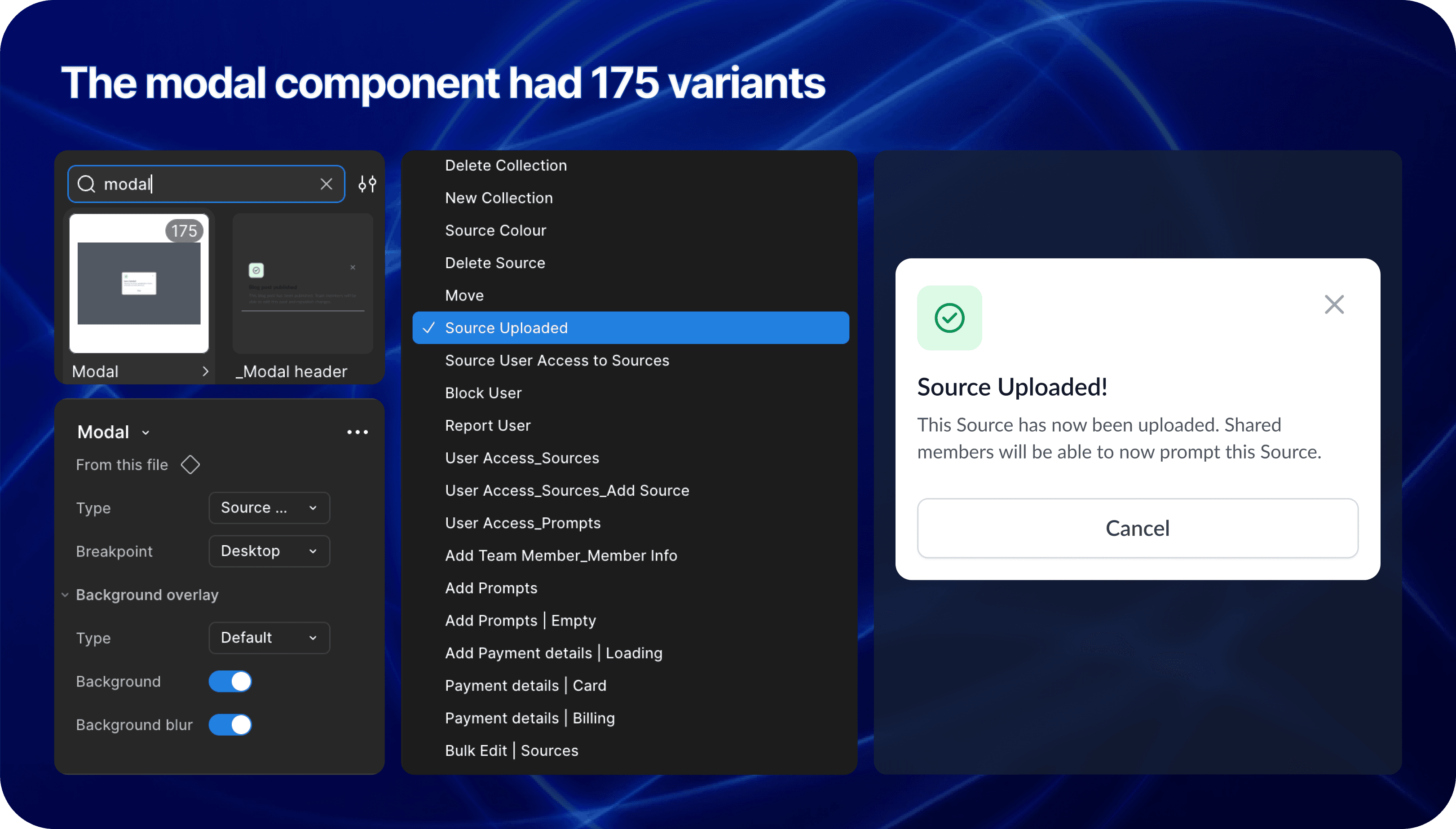
1. The "Artistic" Debt
The previous designer created a system that was visually stunning but structurally rigid. It was built for a "happy path" gallery.
The Component Trap: Instead of a scalable modal with variant properties, we had a new variant for every single scenario.
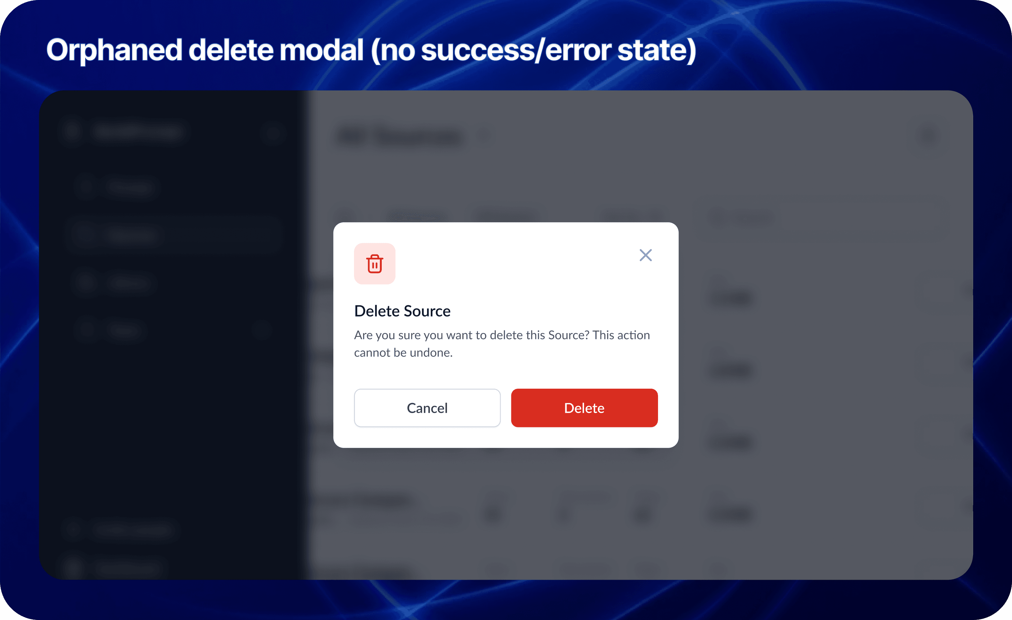
Orphan Screens: The designs were static snapshots. There were no user flows, no error states, and no logic for when the LLM failed.
2. The Communication Vacuum
Sales kept promising features that Engineering couldn't estimate because the specs were vague. The CTO was burning out trying to act as Product Manager, Architect, and Designer all at once.
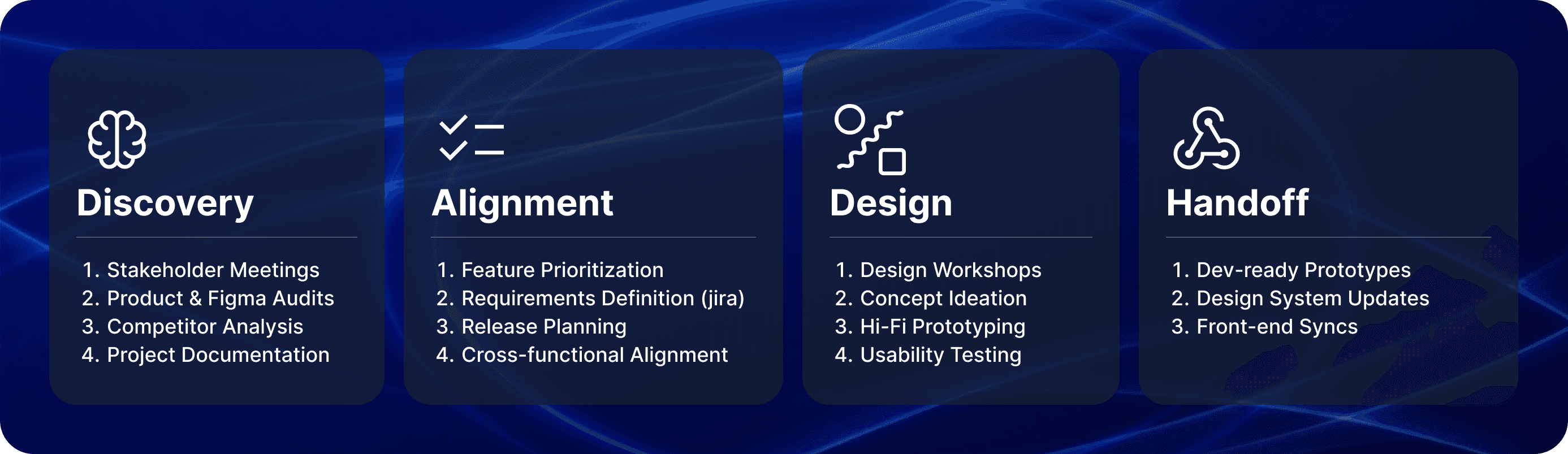
My Role: The Translator & Architect
I didn't just push pixels; I functioned as a strategic mediator. I used my technical background to sit with Sales and translate their "Why" into technical user stories that the CTO could actually build.
The Tactic: I used the Weekly Decision Meeting to facilitate real-time trade-offs. If Sales wanted a new feature, I explained the technical debt it would create. We moved from a "Wish List" to a realistic Roadmap.
The Craft: Designing for AI Complexity
My core design challenge was moving the user from "playing with a chatbot" to "managing an enterprise workflow." I introduced four pivot features that transformed the UX:
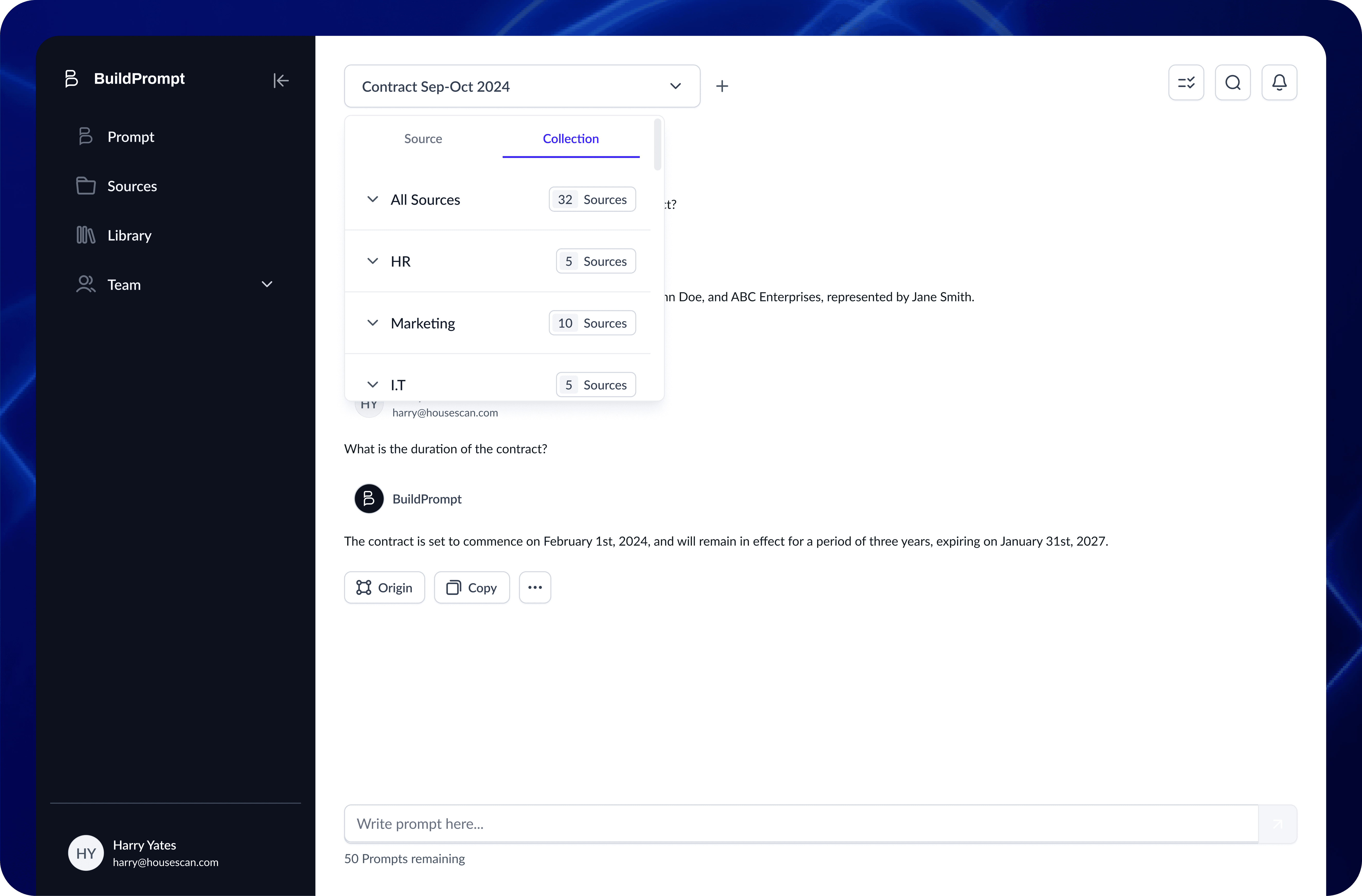
1. Scaling RAG: From Single File to Collections
The Context: The engineering team achieved a massive breakthrough: enabling RAG (Retrieval-Augmented Generation) across entire folders of documents, not just single files.
The Design: The temptation was to build a complex new interface. Instead, I chose invisibility. I introduced a simple "Scope Switch" tab (Docs vs. Collections).
The Win: By using a familiar UI pattern to trigger a complex backend capability, we kept the learning curve at zero while expanding the tool’s power exponentially.
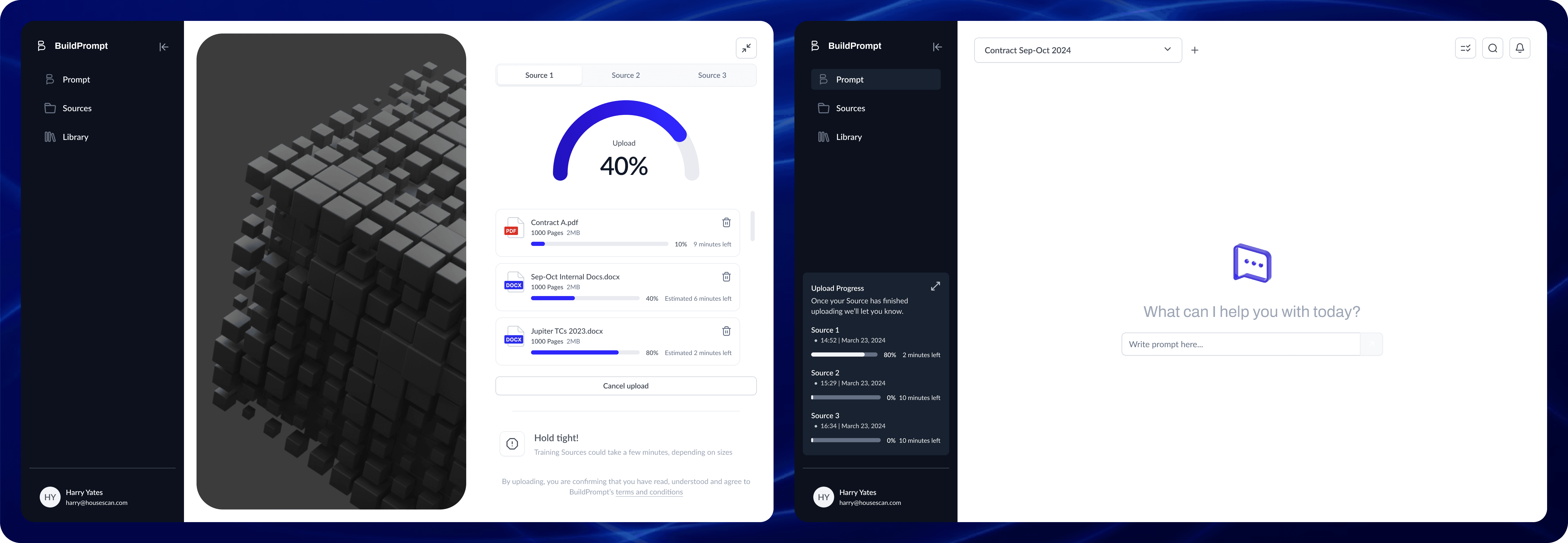
2. Async Multi-Tasking
The Problem: The UI blocked the user while the AI "thought" (sometimes for 30+ seconds).
The Solution: I introduced a background processing state. Users could now upload files and start new analyses while previous ones processed.
Impact: This friction removal contributed to a 50% increase in Session Duration.
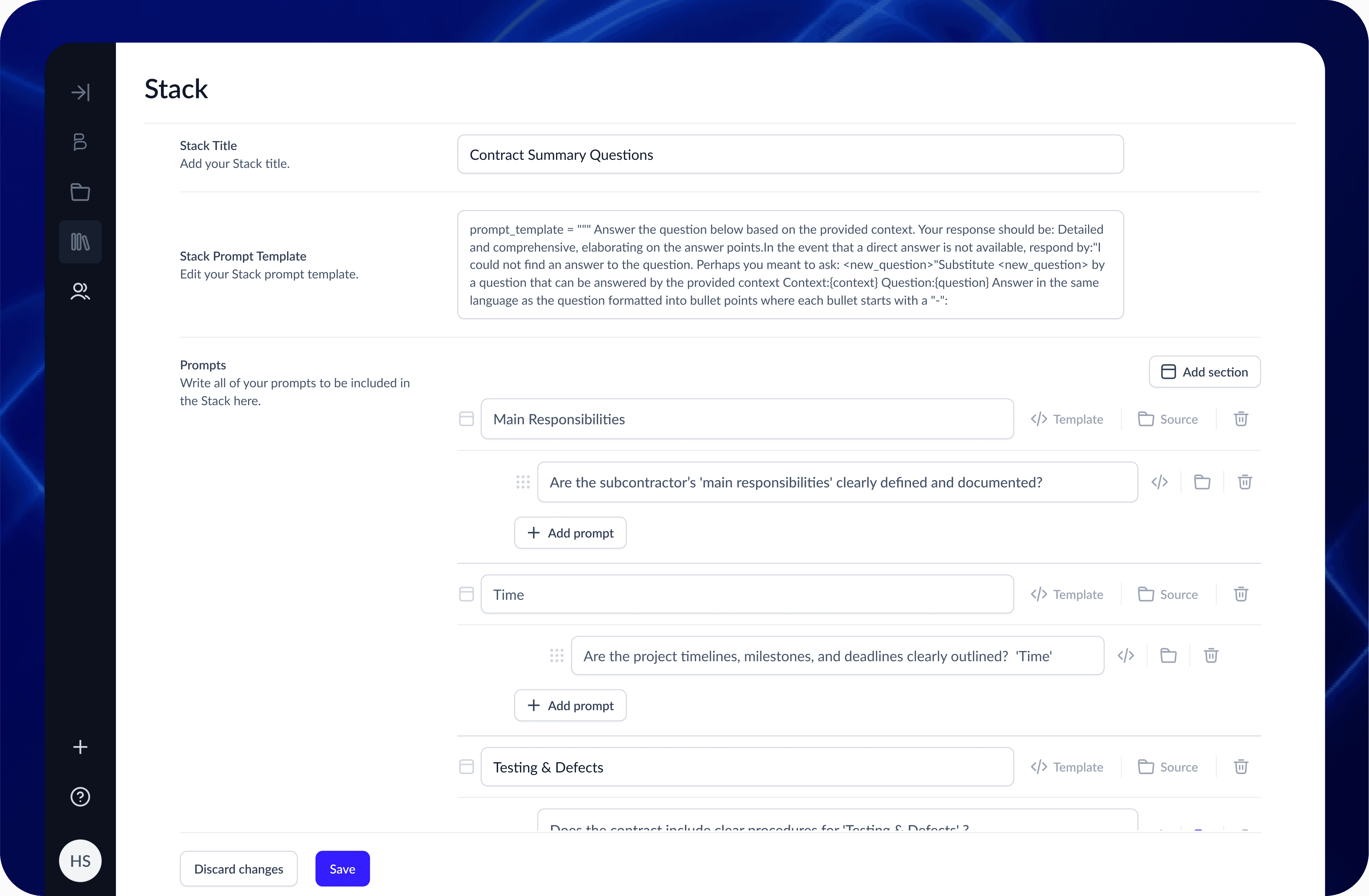
3. Chained Logic Workflows
The Feature: We built a builder that allowed users to launch specific prompts based on the results of a previous prompt.
The Craft: Visualizing invisible logic. I designed a node-based view where users could see how Prompt A (Extract Date) fed into Prompt B (Verify Deadline).
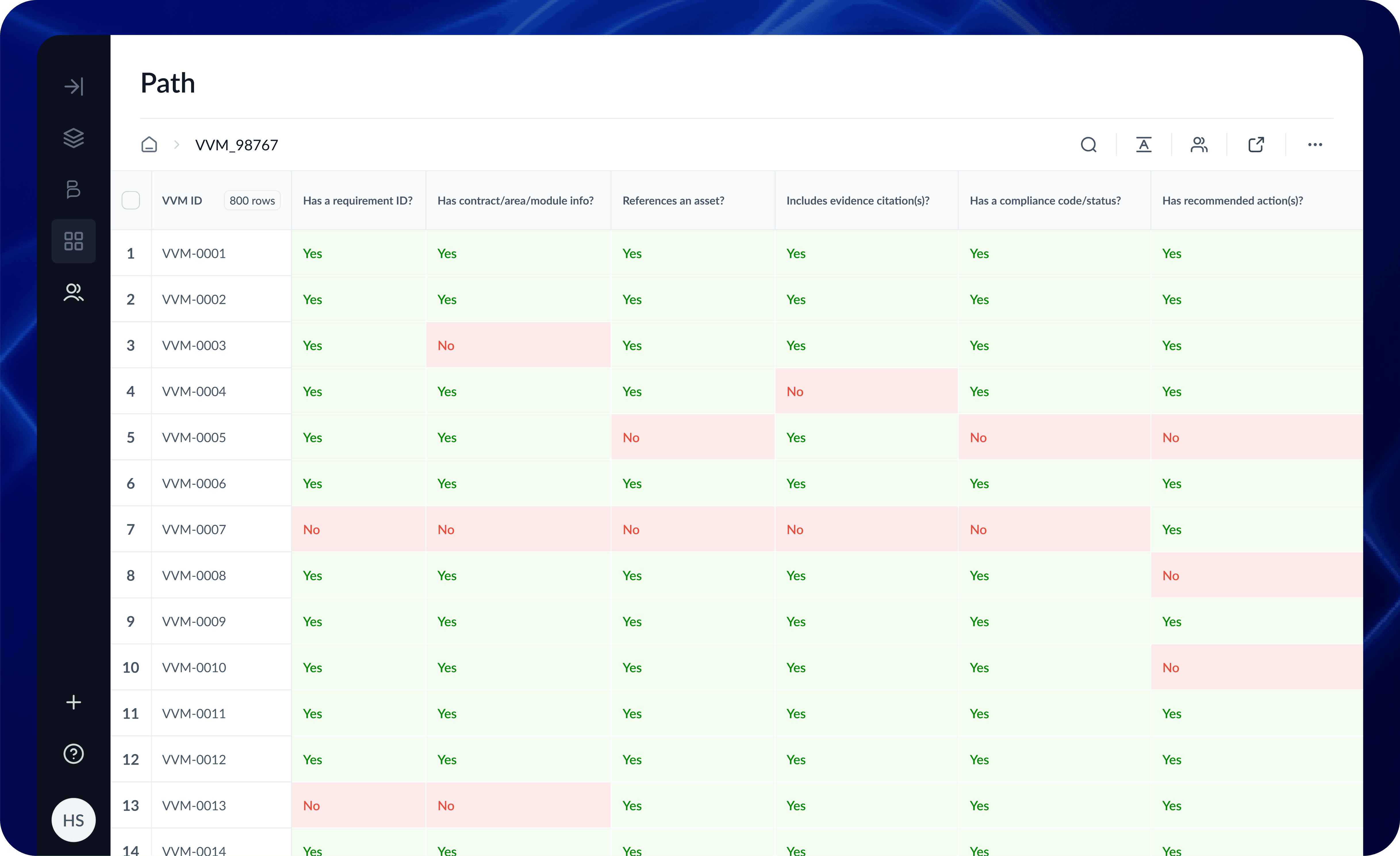
4. User-Defined Conditional Logic
The Feature: Users needed to scan massive reports for specific risks.
The Craft: I designed a "Keyword Highlighter" system. Instead of relying on AI to guess what mattered, users could define their own rules—custom color-coding for specific answers, or filtering documents that started with specific project codes (e.g., "HS2-").
Impact: This shifted the UI from passive reading to active auditing, significantly speeding up data absorption.
The Real-World Test: HS2
All these features came together for the HS2 (High Speed 2) project. They needed to analyze thousands of "Verification and Validation Certificates" (VVCs). By using the Collection feature to ingest files and the Chained Workflows to cross-reference dates, we turned a manual nightmare into an automated flow.
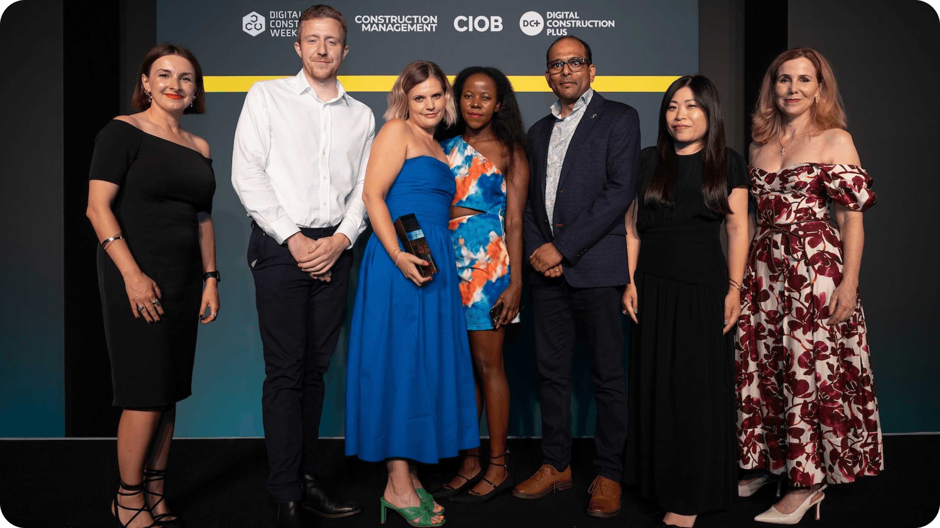
The BuildPrompt team collect their trophy from Karolina Orecchini of Digital Construction Week (far left), Lilian Ho of Aecom (second right) and Sally Phillips (far right) (Photo © 2025 – ASV Photography Ltd. www.ASVphotos.com)
Delivery: Building with Handcuffs On
We didn't have time to rewrite the codebase. I had to be pragmatic. I kept the legacy design system and applied tweaks to design the new features. I often shared a "North Star" vision, a mockup of how it could look to keep the team inspired while we shipped the MVP.

Results
The shift from chaotic one-offs to a structured system paid off in hard metrics.
+50% Session Duration (due to Async workflows)
~25% Increase in Dev Velocity (due to clear specs)
-80% Time spent in clarification meetings
12 Enterprise features shipped in 90 days
Winner: Best Use of AI, Digital Construction Awards 2025 (BuildPrompt x HS2)
+50%
+50%
Session Duration
+25%
+25%
Dev Velocity
-80%
-80%
UI clarification meetings
12 features
12 features
shipped in 12 weeks
AI Design Learnings
This project was a crash course in the specific constraints of Gen AI.
Feedback Ubiquity: While basic feedback loops existed when I joined, I standardized their accessibility. I ensured that the ability to rate or correct an AI output wasn't hidden in settings but was present every single time GenAI generated text. Consistency builds trust.
Designing for Hallucination: I learned that UI must encourage verification. We leaned into "citation tooltips" so users could instantly check the source text (RAG evidence) when the AI made a claim.
Latency as UX: When an LLM takes 20 seconds, you can't just use a spinner. You need to communicate what it is doing ("Reading," "Extracting," "Verifying") to keep trust high.
Closing
We proved that stabilizing a chaotic environment isn't about working more hours—it's about adding structure where it matters. By balancing the "Craft" of detailed interaction design with the "Strategy" of product management, we turned a fragile prototype into an award-winning platform.
More Projects


UI / UX Design
Stabilizing the Chaos: Bridging the Gap Between Sales Promises and Dev Reality
Scaling an AI startup is hard enough, but trying to do it when your design, sales, and engineering teams are speaking three different languages is nearly impossible. I stepped into BuildPrompt at a moment when the "move fast" mentality had finally caught up with them, threatening to stall the very enterprise deals they needed to survive.
Industry :
AI / SaaS (Document Analysis)
Client :
BuildPrompt
Project Duration :
12 weeks
Year :
2025
TLDR
BuildPrompt risked losing enterprise contracts due to a fragmented roadmap and a non-scalable design legacy. Leveraging my technical background, I acted as the bridge between Sales and Engineering while redesigning core workflows for mass scalability. We shipped 12 features in 90 days, drastically increasing user engagement and ultimately leading the product to win "Best Use of AI" at the Digital Construction Awards 2025.
The Tension: High Stakes, Broken Foundation
To close major contracts, we needed to integrate complex features like bulk analysis and custom reporting. However, the foundation was crumbling under two specific pressures:
1. The "Artistic" Debt
The previous designer created a system that was visually stunning but structurally rigid. It was built for a "happy path" gallery.
The Component Trap: Instead of a scalable modal with variant properties, we had a new variant for every single scenario.
Orphan Screens: The designs were static snapshots. There were no user flows, no error states, and no logic for when the LLM failed.
2. The Communication Vacuum
Sales kept promising features that Engineering couldn't estimate because the specs were vague. The CTO was burning out trying to act as Product Manager, Architect, and Designer all at once.
My Role: The Translator & Architect
I didn't just push pixels; I functioned as a strategic mediator. I used my technical background to sit with Sales and translate their "Why" into technical user stories that the CTO could actually build.
The Tactic: I used the Weekly Decision Meeting to facilitate real-time trade-offs. If Sales wanted a new feature, I explained the technical debt it would create. We moved from a "Wish List" to a realistic Roadmap.
The Craft: Designing for AI Complexity
My core design challenge was moving the user from "playing with a chatbot" to "managing an enterprise workflow." I introduced four pivot features that transformed the UX:
1. Scaling RAG: From Single File to Collections
The Context: The engineering team achieved a massive breakthrough: enabling RAG (Retrieval-Augmented Generation) across entire folders of documents, not just single files.
The Design: The temptation was to build a complex new interface. Instead, I chose invisibility. I introduced a simple "Scope Switch" tab (Docs vs. Collections).
The Win: By using a familiar UI pattern to trigger a complex backend capability, we kept the learning curve at zero while expanding the tool’s power exponentially.
2. Async Multi-Tasking
The Problem: The UI blocked the user while the AI "thought" (sometimes for 30+ seconds).
The Solution: I introduced a background processing state. Users could now upload files and start new analyses while previous ones processed.
Impact: This friction removal contributed to a 50% increase in Session Duration.
3. Chained Logic Workflows
The Feature: We built a builder that allowed users to launch specific prompts based on the results of a previous prompt.
The Craft: Visualizing invisible logic. I designed a node-based view where users could see how Prompt A (Extract Date) fed into Prompt B (Verify Deadline).
4. User-Defined Conditional Logic
The Feature: Users needed to scan massive reports for specific risks.
The Craft: I designed a "Keyword Highlighter" system. Instead of relying on AI to guess what mattered, users could define their own rules—custom color-coding for specific answers, or filtering documents that started with specific project codes (e.g., "HS2-").
Impact: This shifted the UI from passive reading to active auditing, significantly speeding up data absorption.
The Real-World Test: HS2
All these features came together for the HS2 (High Speed 2) project. They needed to analyze thousands of "Verification and Validation Certificates" (VVCs). By using the Collection feature to ingest files and the Chained Workflows to cross-reference dates, we turned a manual nightmare into an automated flow.
The BuildPrompt team collect their trophy from Karolina Orecchini of Digital Construction Week (far left), Lilian Ho of Aecom (second right) and Sally Phillips (far right) (Photo © 2025 – ASV Photography Ltd. www.ASVphotos.com)
Delivery: Building with Handcuffs On
We didn't have time to rewrite the codebase. I had to be pragmatic. I kept the legacy design system and applied tweaks to design the new features. I often shared a "North Star" vision, a mockup of how it could look to keep the team inspired while we shipped the MVP.
Results
The shift from chaotic one-offs to a structured system paid off in hard metrics.
+50% Session Duration (due to Async workflows)
~25% Increase in Dev Velocity (due to clear specs)
-80% Time spent in clarification meetings
12 Enterprise features shipped in 90 days
Winner: Best Use of AI, Digital Construction Awards 2025 (BuildPrompt x HS2)
+50%
+50%
Session Duration
+25%
+25%
Dev Velocity
-80%
-80%
UI clarification meetings
12 features
12 features
shipped in 12 weeks
AI Design Learnings
This project was a crash course in the specific constraints of Gen AI.
Feedback Ubiquity: While basic feedback loops existed when I joined, I standardized their accessibility. I ensured that the ability to rate or correct an AI output wasn't hidden in settings but was present every single time GenAI generated text. Consistency builds trust.
Designing for Hallucination: I learned that UI must encourage verification. We leaned into "citation tooltips" so users could instantly check the source text (RAG evidence) when the AI made a claim.
Latency as UX: When an LLM takes 20 seconds, you can't just use a spinner. You need to communicate what it is doing ("Reading," "Extracting," "Verifying") to keep trust high.
Closing
We proved that stabilizing a chaotic environment isn't about working more hours—it's about adding structure where it matters. By balancing the "Craft" of detailed interaction design with the "Strategy" of product management, we turned a fragile prototype into an award-winning platform.
More Projects
UI / UX Design
Stabilizing the Chaos: Bridging the Gap Between Sales Promises and Dev Reality
Scaling an AI startup is hard enough, but trying to do it when your design, sales, and engineering teams are speaking three different languages is nearly impossible. I stepped into BuildPrompt at a moment when the "move fast" mentality had finally caught up with them, threatening to stall the very enterprise deals they needed to survive.
Industry :
AI / SaaS (Document Analysis)
Client :
BuildPrompt
Project Duration :
12 weeks
Year :
2025
TLDR
BuildPrompt risked losing enterprise contracts due to a fragmented roadmap and a non-scalable design legacy. Leveraging my technical background, I acted as the bridge between Sales and Engineering while redesigning core workflows for mass scalability. We shipped 12 features in 90 days, drastically increasing user engagement and ultimately leading the product to win "Best Use of AI" at the Digital Construction Awards 2025.
The Tension: High Stakes, Broken Foundation
To close major contracts, we needed to integrate complex features like bulk analysis and custom reporting. However, the foundation was crumbling under two specific pressures:
1. The "Artistic" Debt
The previous designer created a system that was visually stunning but structurally rigid. It was built for a "happy path" gallery.
The Component Trap: Instead of a scalable modal with variant properties, we had a new variant for every single scenario.
Orphan Screens: The designs were static snapshots. There were no user flows, no error states, and no logic for when the LLM failed.
2. The Communication Vacuum
Sales kept promising features that Engineering couldn't estimate because the specs were vague. The CTO was burning out trying to act as Product Manager, Architect, and Designer all at once.
My Role: The Translator & Architect
I didn't just push pixels; I functioned as a strategic mediator. I used my technical background to sit with Sales and translate their "Why" into technical user stories that the CTO could actually build.
The Tactic: I used the Weekly Decision Meeting to facilitate real-time trade-offs. If Sales wanted a new feature, I explained the technical debt it would create. We moved from a "Wish List" to a realistic Roadmap.
The Craft: Designing for AI Complexity
My core design challenge was moving the user from "playing with a chatbot" to "managing an enterprise workflow." I introduced four pivot features that transformed the UX:
1. Scaling RAG: From Single File to Collections
The Context: The engineering team achieved a massive breakthrough: enabling RAG (Retrieval-Augmented Generation) across entire folders of documents, not just single files.
The Design: The temptation was to build a complex new interface. Instead, I chose invisibility. I introduced a simple "Scope Switch" tab (Docs vs. Collections).
The Win: By using a familiar UI pattern to trigger a complex backend capability, we kept the learning curve at zero while expanding the tool’s power exponentially.
2. Async Multi-Tasking
The Problem: The UI blocked the user while the AI "thought" (sometimes for 30+ seconds).
The Solution: I introduced a background processing state. Users could now upload files and start new analyses while previous ones processed.
Impact: This friction removal contributed to a 50% increase in Session Duration.
3. Chained Logic Workflows
The Feature: We built a builder that allowed users to launch specific prompts based on the results of a previous prompt.
The Craft: Visualizing invisible logic. I designed a node-based view where users could see how Prompt A (Extract Date) fed into Prompt B (Verify Deadline).
4. User-Defined Conditional Logic
The Feature: Users needed to scan massive reports for specific risks.
The Craft: I designed a "Keyword Highlighter" system. Instead of relying on AI to guess what mattered, users could define their own rules—custom color-coding for specific answers, or filtering documents that started with specific project codes (e.g., "HS2-").
Impact: This shifted the UI from passive reading to active auditing, significantly speeding up data absorption.
The Real-World Test: HS2
All these features came together for the HS2 (High Speed 2) project. They needed to analyze thousands of "Verification and Validation Certificates" (VVCs). By using the Collection feature to ingest files and the Chained Workflows to cross-reference dates, we turned a manual nightmare into an automated flow.
The BuildPrompt team collect their trophy from Karolina Orecchini of Digital Construction Week (far left), Lilian Ho of Aecom (second right) and Sally Phillips (far right) (Photo © 2025 – ASV Photography Ltd. www.ASVphotos.com)
Delivery: Building with Handcuffs On
We didn't have time to rewrite the codebase. I had to be pragmatic. I kept the legacy design system and applied tweaks to design the new features. I often shared a "North Star" vision, a mockup of how it could look to keep the team inspired while we shipped the MVP.
Results
The shift from chaotic one-offs to a structured system paid off in hard metrics.
+50% Session Duration (due to Async workflows)
~25% Increase in Dev Velocity (due to clear specs)
-80% Time spent in clarification meetings
12 Enterprise features shipped in 90 days
Winner: Best Use of AI, Digital Construction Awards 2025 (BuildPrompt x HS2)
+50%
+50%
Session Duration
+25%
+25%
Dev Velocity
-80%
-80%
UI clarification meetings
12 features
12 features
shipped in 12 weeks
AI Design Learnings
This project was a crash course in the specific constraints of Gen AI.
Feedback Ubiquity: While basic feedback loops existed when I joined, I standardized their accessibility. I ensured that the ability to rate or correct an AI output wasn't hidden in settings but was present every single time GenAI generated text. Consistency builds trust.
Designing for Hallucination: I learned that UI must encourage verification. We leaned into "citation tooltips" so users could instantly check the source text (RAG evidence) when the AI made a claim.
Latency as UX: When an LLM takes 20 seconds, you can't just use a spinner. You need to communicate what it is doing ("Reading," "Extracting," "Verifying") to keep trust high.
Closing
We proved that stabilizing a chaotic environment isn't about working more hours—it's about adding structure where it matters. By balancing the "Craft" of detailed interaction design with the "Strategy" of product management, we turned a fragile prototype into an award-winning platform.